
You can tell if a product is premium before you read a single word about it. The weight in your hand. How the lid clicks shut. Whether the box feels built for what's inside or bolted on after the fact. That judgment happens in about 2 seconds, before your customer knows a single fact about the product itself.
That's the part most founders skip past. They spend months getting the formula right, the sourcing right, the price right, and then premium packaging design becomes the thing they handle in the last few weeks before launch, because it's "just the outside."
It's carrying half the sale.
The gap between what's inside and what's outside
I've worked with founders who make genuinely excellent products. Clean formulations. Materials that cost more because they're actually better. And then the packaging sits 2 price tiers below what's in the jar.
Customers can't taste the ingredient list before they buy. They can't feel the fabric weight through a photo. What they can do is read the packaging, fast, and they read it as a proxy for everything they can't check yet. If the packaging looks cheap, the brain files the product as cheap, no matter what's true underneath. Packaging is the loudest piece of your brand identity most strangers will ever see.
Why perceived value is doing more work than you think
Perceived value is the story your packaging tells before your product gets a chance to prove itself. Retail buyers know this. A listing conversation almost always starts with a hard look at the packaging before anyone talks about what's inside it. If the packaging reads generic, the buyer assumes the brand behind it is generic too, and the product never gets the shelf space to prove them wrong.
The same thing happens online. Someone scrolling past your product on Instagram or Amazon isn't reading your founder story first. They're reading the finish, the typography, the colour choices, the way the label sits on the bottle. All of that says "worth the price" or "needs to be cheaper than it is," and it says it before they've read your copy.
Premium packaging design means every visual decision matches the actual promise of the product: the weight of the paper stock, the restraint in the typography. Done right, it makes the price feel obvious instead of negotiable.
Humantra: what changes when a product leaves the screen for the shelf
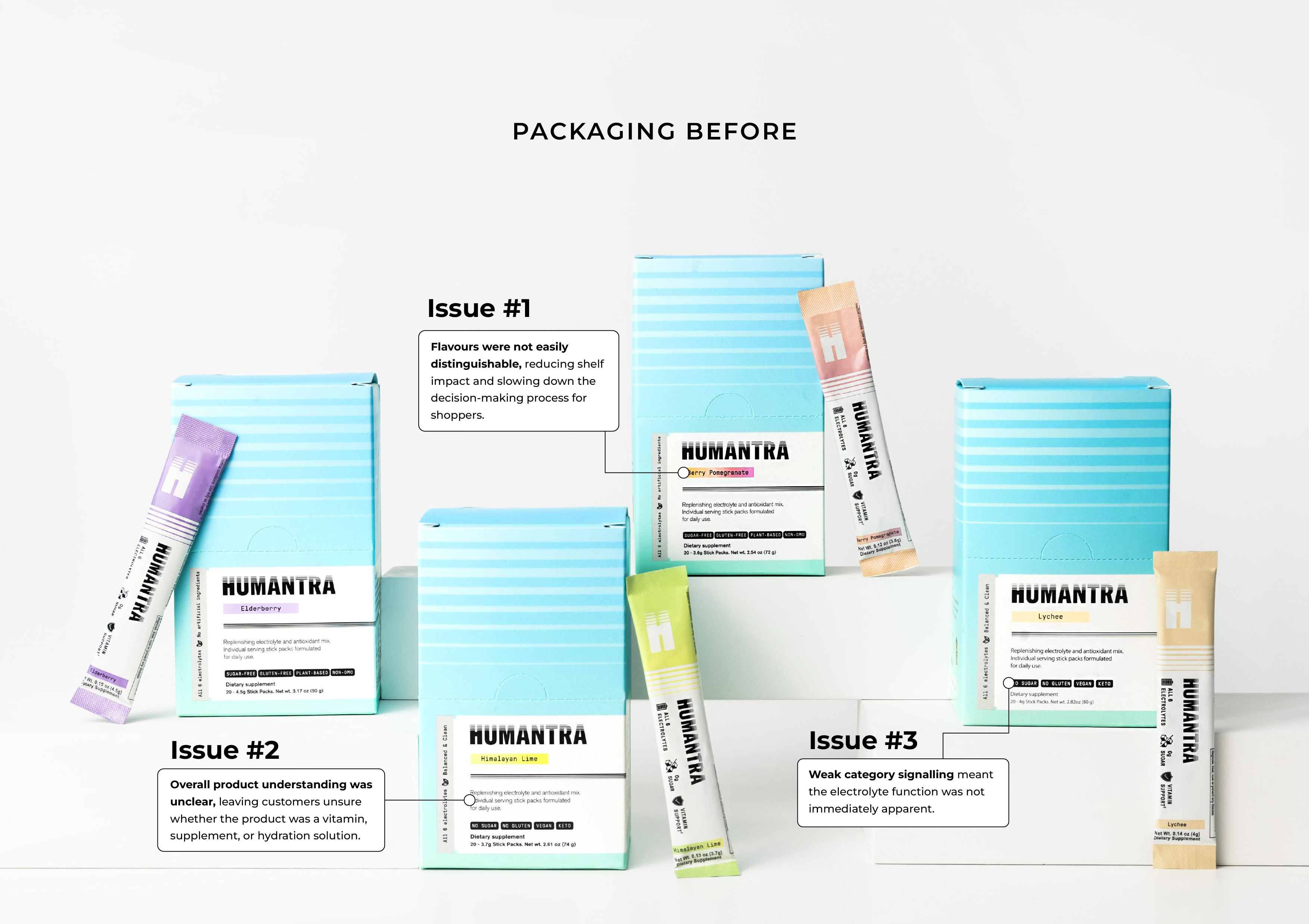
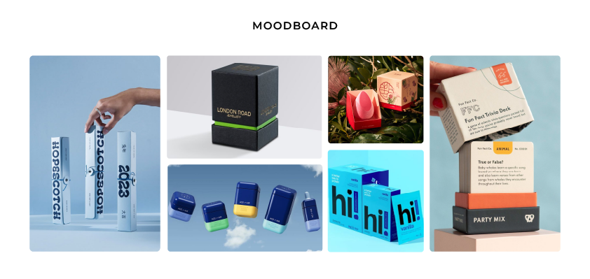
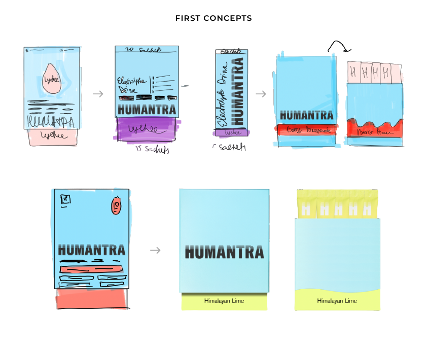
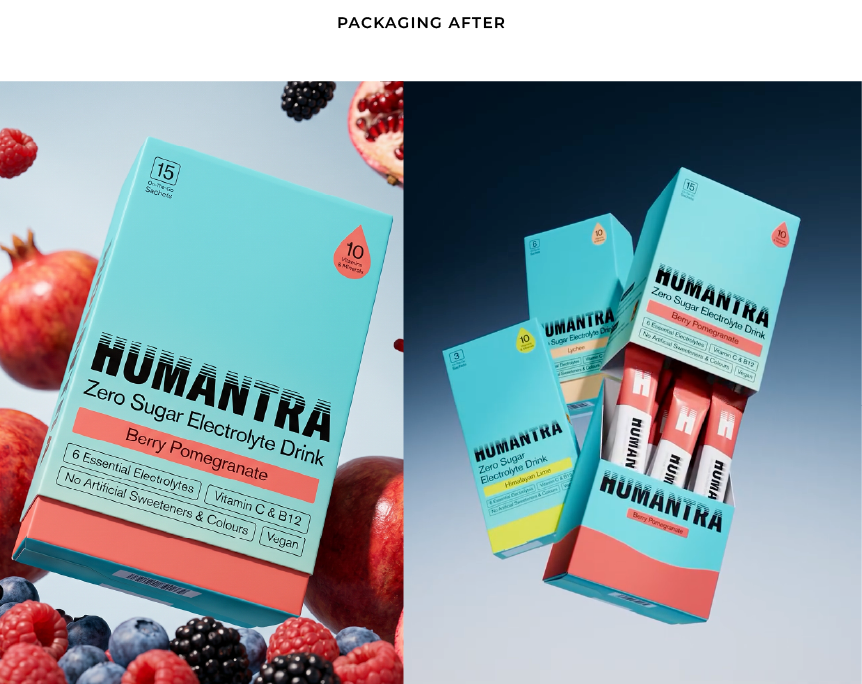

Humantra is an electrolyte and hydration brand built for people who take their performance seriously. Clean, functional, made for everyday athletes, from run clubs to gym floors. And like a lot of modern brands, it was born online. Direct to consumer, sold through a website, photographed for a screen.
Then Boots UK came into the picture. One of the most competitive retail shelves in the country. A pack that had always been a website image now had to hold its own in a place it was never designed for.
I led the packaging redesign for that move, and the problems only really showed up once you looked at the pack under retail light.
The flavours weren't distinguishable from each other, even though the brand's whole claim was that it tasted better than the competition. If that's your pitch, the flavour has to be the loudest thing on the pack, and it wasn't. What the product even was took too long to read: the key word was printed on there, but it sat where nobody's eye landed first. And the opening, fine for a parcel posted across a city, deformed in transit once the product started shipping between countries.
None of that reads as premium on a shelf. It reads as a brand that hasn't quite earned its spot yet.
So the pack was rebuilt around what a stranger's eye actually does in the couple of seconds it spends scanning a shelf. A new hierarchy: you see the colour first and make the flavour connection, then the brand name, in that order. The flavour became the dominant element instead of an afterthought. The opening was re-engineered so it survived the journey. The system was designed to work across the sachet formats a retailer needs, not just the single size that suited a website.
The point isn't any one of those fixes. It's that a product doesn't get a second look on a shelf. The packaging either says "this belongs here, at this price" in the first glance, or it quietly says the opposite. Humantra had the product to justify the shelf. The packaging just needed to say so before anyone picked it up.
Where founders get this wrong
The most common mistake is spending on the wrong things.
A founder will pour budget into a beautiful logo and leave the actual packaging structure, the box, the label, the material choice, as an afterthought handled by whatever printer is fastest. The logo looks premium in isolation. Next to the real product, the gap shows immediately.
The second mistake is designing for the screen and forgetting the shelf, or the reverse. A pack can look gorgeous in a product photo and fall apart in the hand: thinner stock than the render implied, a finish that scuffs after one shipment. The photo and the real thing tell two different stories, and the customer only ever meets the second one.

What premium packaging design actually signals (without inflating your budget)
You don't need the biggest budget in your category to look like you belong in it. A few things matter more than spend.
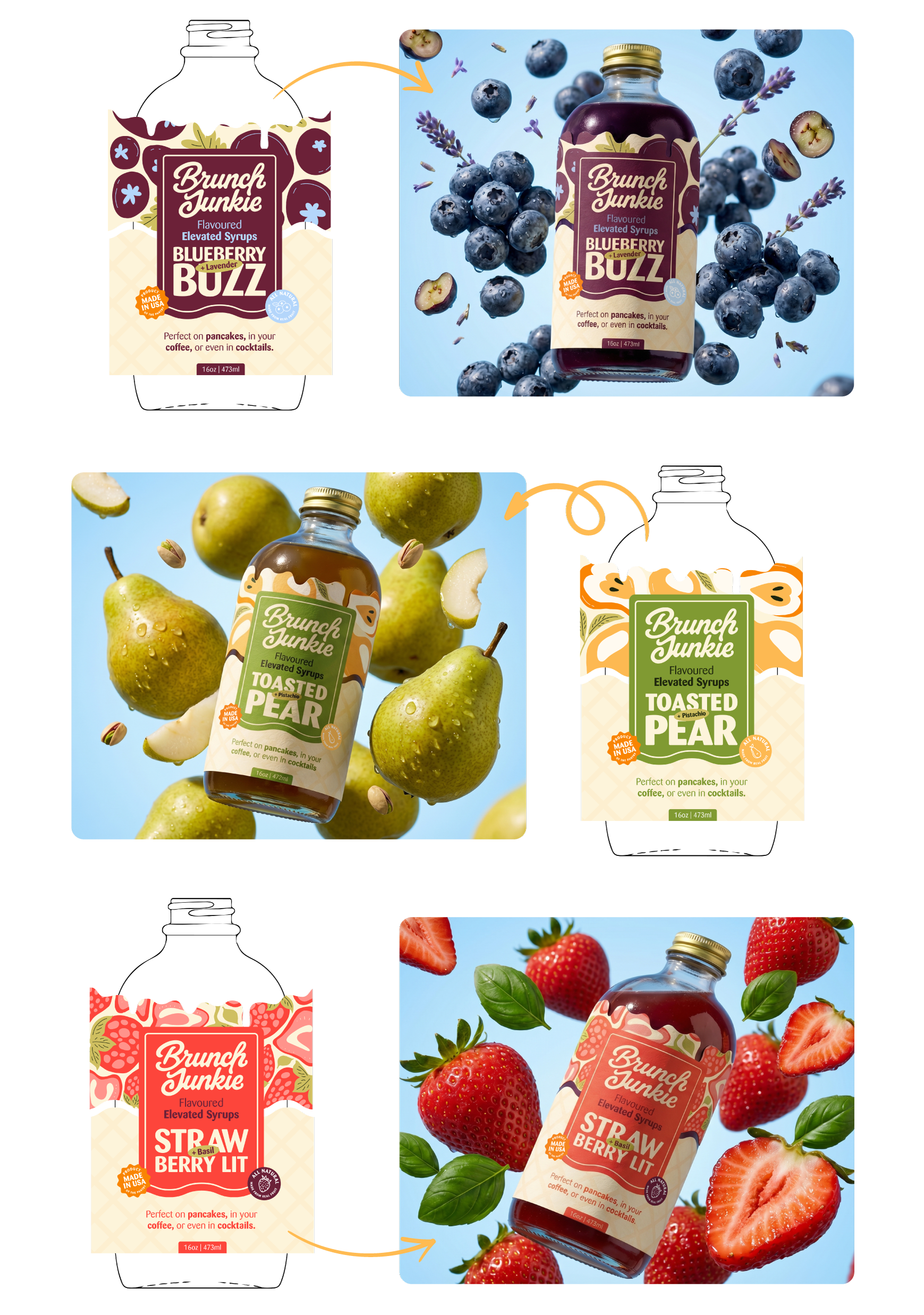
Material choice reads before anything else does. A slightly heavier stock, a soft-touch finish, a label that sits flush instead of slightly crooked, these register instantly and cost less than most founders assume.
Restraint reads as confidence. Brands that are unsure of themselves fill every inch of the packaging with claims, icons, and badges. Premium brands leave space. Negative space tells the customer the brand doesn't need to shout.
Consistency across the packaging system matters more than any single asset. A stunning outer box with a flimsy inner pouch breaks the illusion the moment someone opens it. Premium is the absence of a weak decision anywhere in the system, not one great one.
Typography does more work than most founders expect. A well-chosen typeface, used with discipline, can carry more premium signal than an expensive print finish.
Before you brief a designer
Pull whatever's in front of you right now, your current packaging, or a mockup if you haven't launched yet, and look at it the way a stranger would. Someone who's never heard your founder story and doesn't know what's inside. Ask what it's telling them about the price before they've read a word. If the honest answer doesn't match what you're actually charging, that's the gap worth closing. It's usually smaller and cheaper to fix than founders expect.
Packaging is doing a job whether you've designed it on purpose or not. It's either backing up the price you're charging or quietly working against it. Most founders don't need a bigger budget to fix that. They need someone who knows which few decisions actually move perceived value, and which ones are just noise.
If you're looking at your current packaging and getting that quiet feeling that it's not saying what your product deserves, I'd be glad to take a look. Book a free discovery call here.