AaBbCc
DdEeFf
ABCDEFGHIJKLMNO PQRSTUVWXYZabcdefghijklmnop qrstuvwxyz1234567890@!#$% ^&*(){}[]:;',.?/
drag
Brand Pillars
Tagline
Comfort carried through centuries.
Andria Home was founded by two sisters in Alexandria, Egypt, a city that has woven cotton since antiquity. The brief was to build a luxury home brand that feels Egyptian at its core, not as an exotic reference, but as lived heritage.
We anchored the strategy around one truth: Egyptian cotton is not a material, it's a craft. The brand voice is quiet, confident, and heirloom-focused. No loud luxury. Just weight, softness, and traceability.
Positioning
Egyptian cotton home essentials, grown and made in the Nile Delta, for a global quiet-luxury customer.
Audience
Design-conscious homeowners 28-45 who value provenance over logo. US, GCC, EU.
Promise
MADE IN ALEXANDRIA. Every thread traceable to the field.
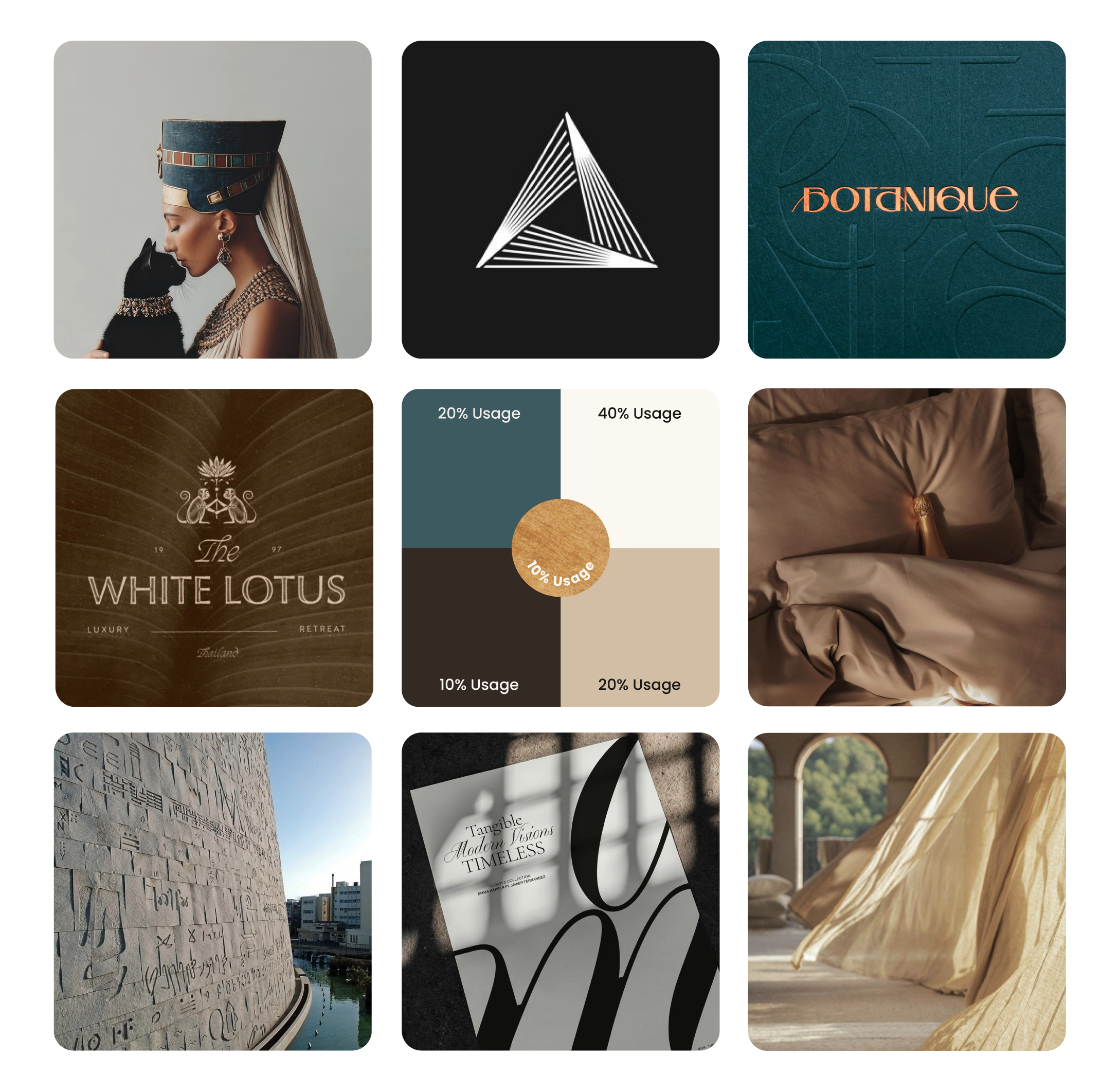
Inspired by the Library of Alexandria, this direction takes the city as a feeling: still, grounded and quietly sophisticated, with a calm that won’t date. A rich dark teal drawn from the Mediterranean anchors the palette. Deep stony neutrals give it weight, and muted gold adds a soft touch of elegance. The detail lives in pattern and texture. A hand-painted Alexandria pattern and the cotton motif from the logo run through packaging, print and digital, pressed in with embossing and debossing so you feel them as much as see them.

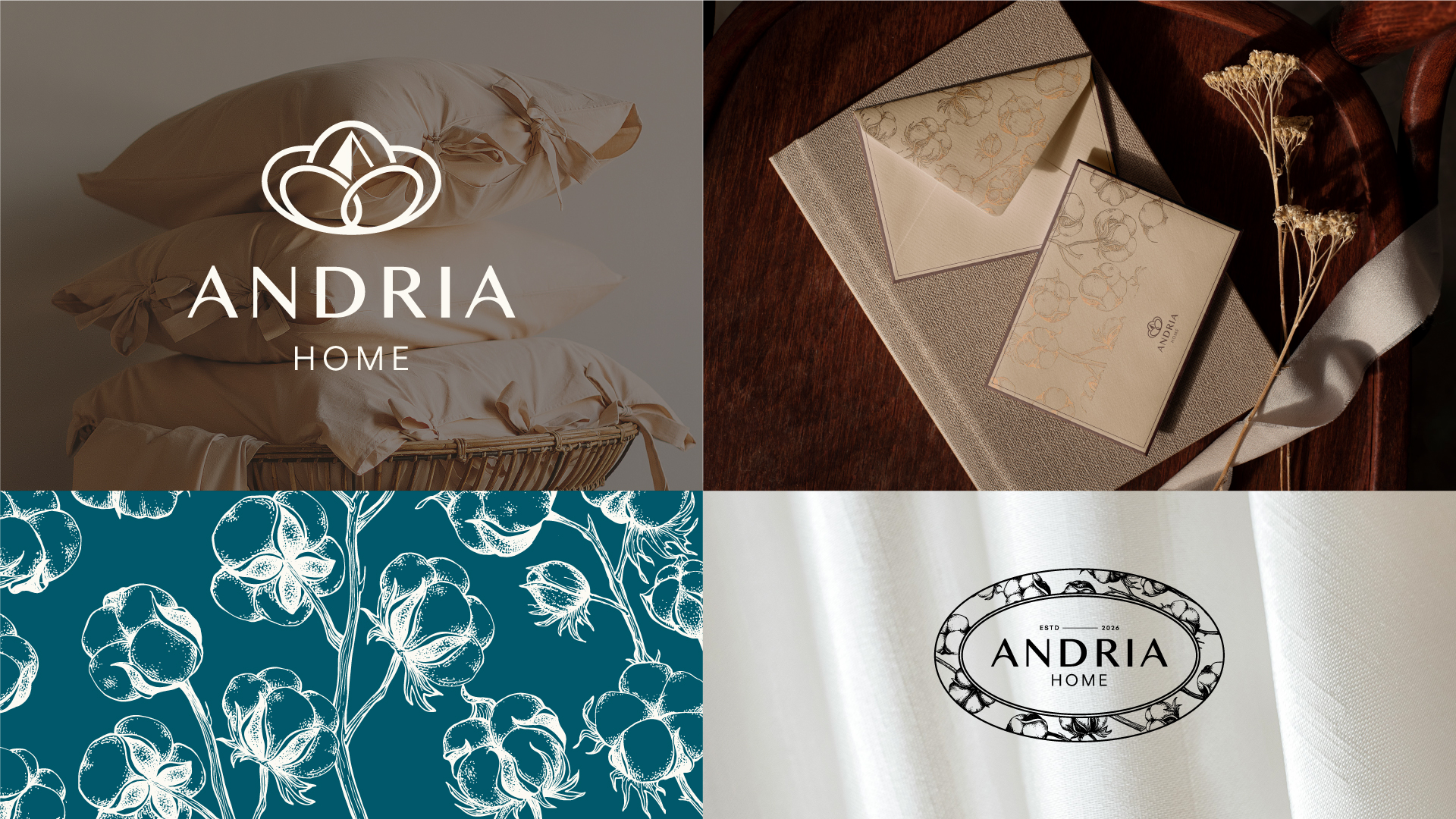
The mark is built from two overlapping ovals, representing the sisters. At the intersection sits a cotton boll, and in the negative space, a subtle pyramid.
1.
Two Sisters
The overlapping oval shapes represent the two sisters behind Andria Home, symbolising the shared foundation on which the brand is built.

2.
Cotton
The central organic form references cotton itself, reflecting purity and the soft comfort at the core of the brand.

3.
Pyramid
A subtle pyramid emerges through negative space, quietly referencing Egyptian heritage and authenticity in a restrained, modern way.

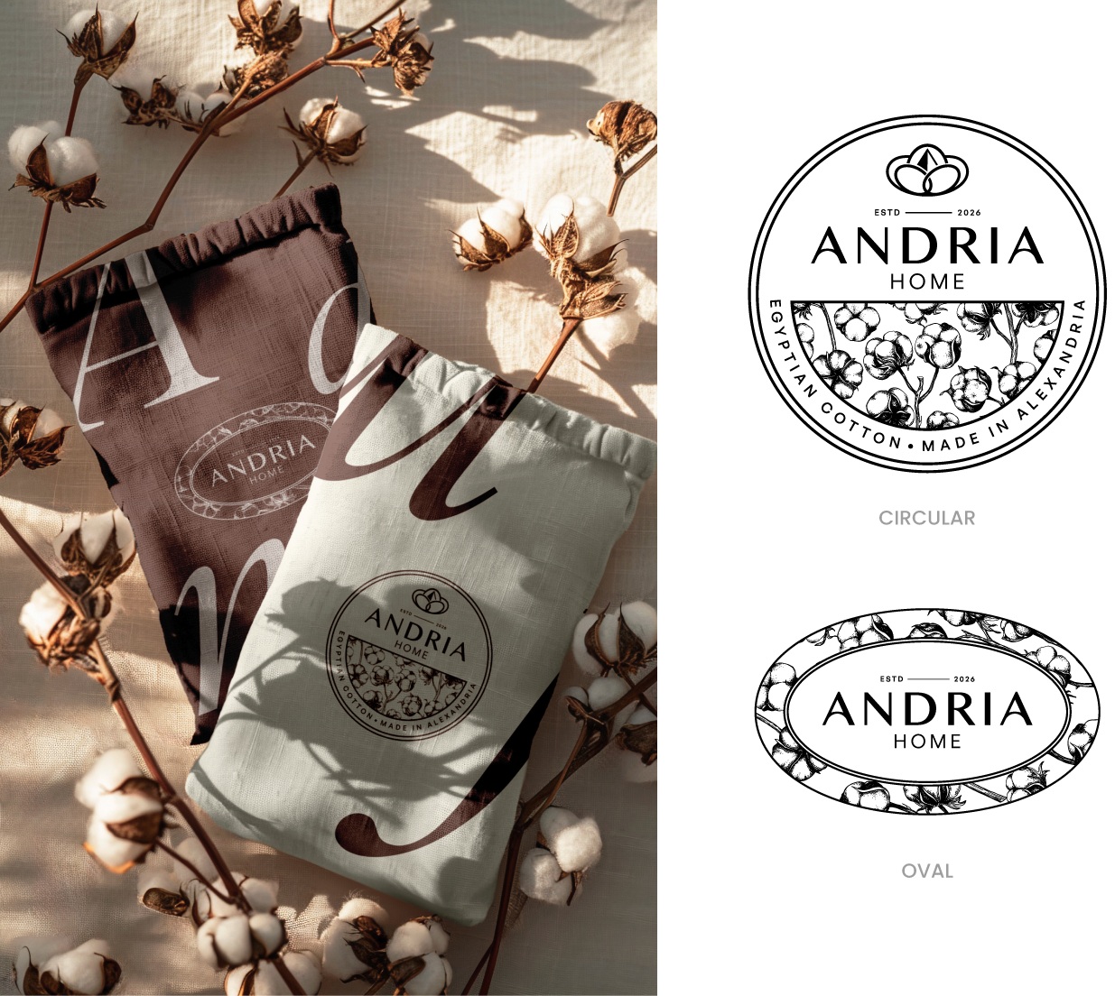
Two emblems, circular and oval, built from the core logo and the hand-drawn cotton pattern. They carry the “Egyptian Cotton, Made in Alexandria” story in a compact mark that sits easily on labels, dust bags, stamps and social. They work as quiet accents next to the main logo, adding texture and a sense of heritage wherever the brand shows up.
A walk through Alexandria in six colors: warm stone underfoot, linen in the shop windows, cedar in the old workshops, and the Mediterranean at the end of every street. Gold appears only in print, as foil you can feel.
AaBbCc
DdEeFf
ABCDEFGHIJKLMNO PQRSTUVWXYZabcdefghijklmnop qrstuvwxyz1234567890@!#$% ^&*(){}[]:;',.?/
AaBbCc
DdEeFf
ABCDEFGHIJKLMNO PQRSTUVWXYZabcdefghijklmnop qrstuvwxyz1234567890@!#$% ^&*(){}[]:;',.?/
AaBbCc
DdEeFf
ABCDEFGHIJKLMNO PQRSTUVWXYZabcdefghijklmnop qrstuvwxyz1234567890@!#$% ^&*(){}[]:;',.?/

Two supporting elements carry the identity beyond the logo: a cotton pattern that adds texture, and a hand-drawn Alexandria that tells the brand's story.
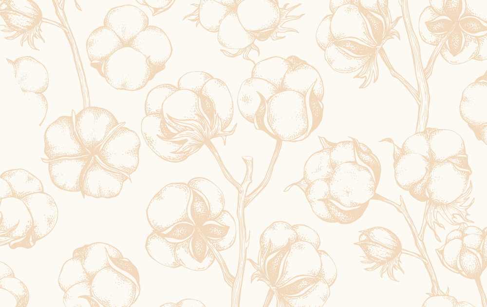
Botanical cotton forms, redrawn in a minimal, elegant line. Used quietly across packaging, print and digital, the pattern adds softness and texture while keeping the brand close to cotton, craft and heritage.

A single hand-drawn line follows the coast, moving through the city's architectural periods as the façades shift. The shoreline holds it together, grounding the brand in Alexandria's layered history and its long relationship with the sea.
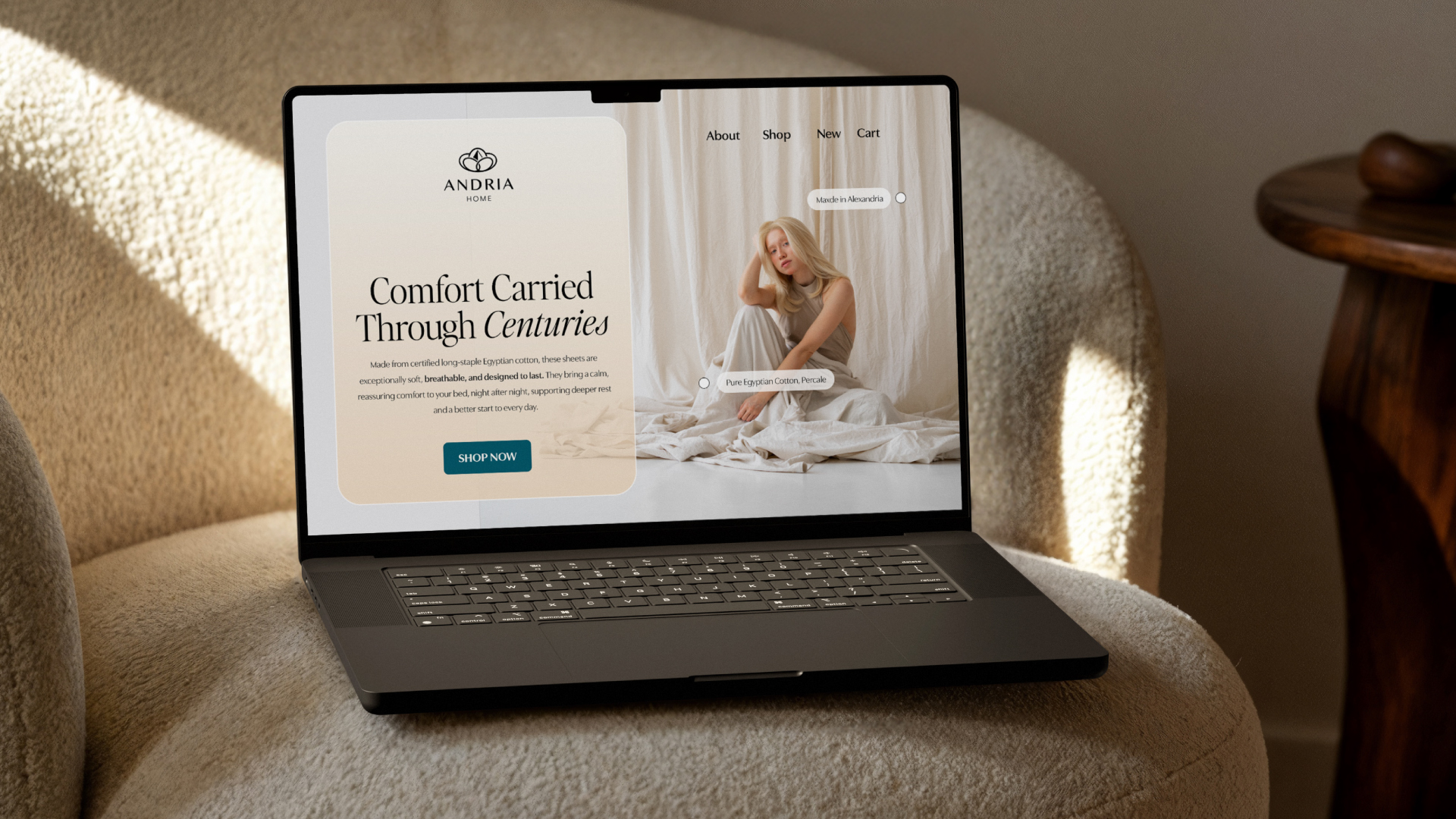
This is where every element meets. Deep teal and stony neutrals set the base, the cotton pattern and Alexandria sketches add texture and story, and Editor's Note gives the brand its voice. Finished with antique gold foil, embossing and debossing, each piece feels as considered in the hand as it looks on the shelf.


Working with Lala was an incredible experience from start to finish. She understood our brand instantly and delivered a brand identity that exceeded our expectations without a single revision. We now feel confident and fully aligned with a strong identity that truly represents our business.