Humantra

Retail Packaging Redesign for Boots UK & Ireland
Boots UK gave Humantra one week to be shelf-ready. The packaging wasn't working. Flavours blurred together on shelf, forcing shoppers to slow down and inspect before deciding. Worse, the product itself was unclear. Nothing on pack said whether it was a vitamin, a supplement, or a hydration drink. And the electrolyte function, the actual reason to buy, wasn't signalling at all.
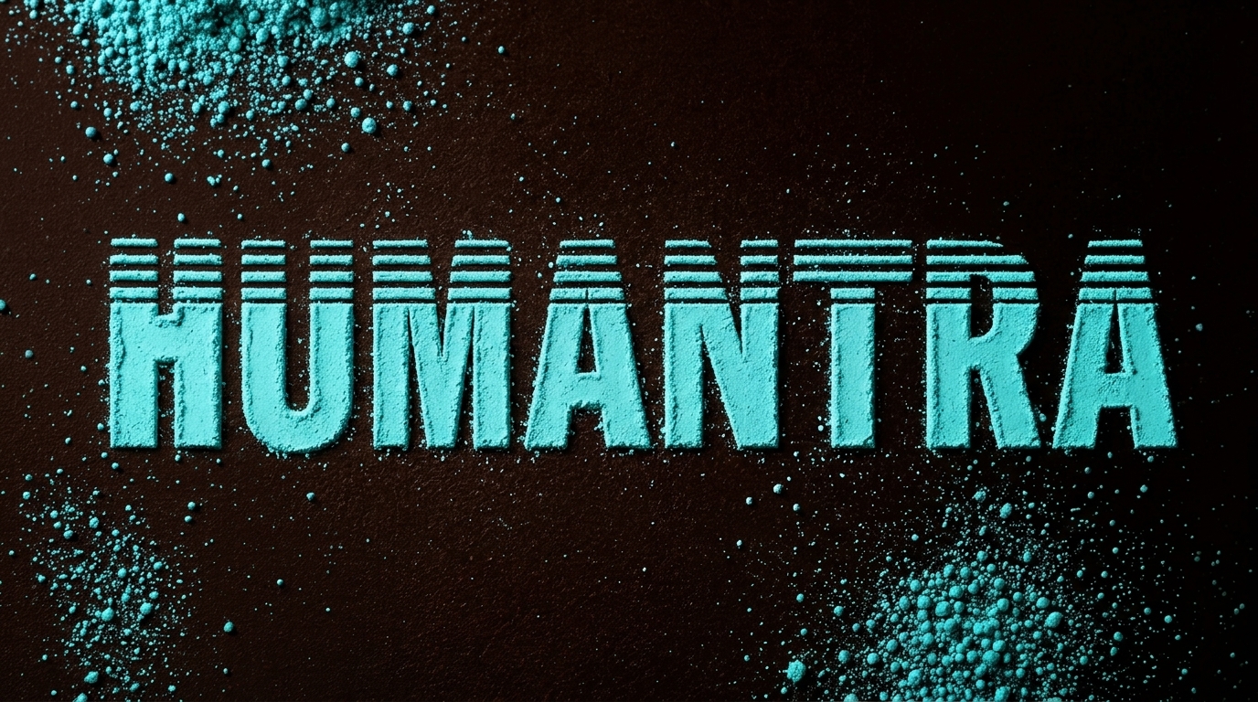
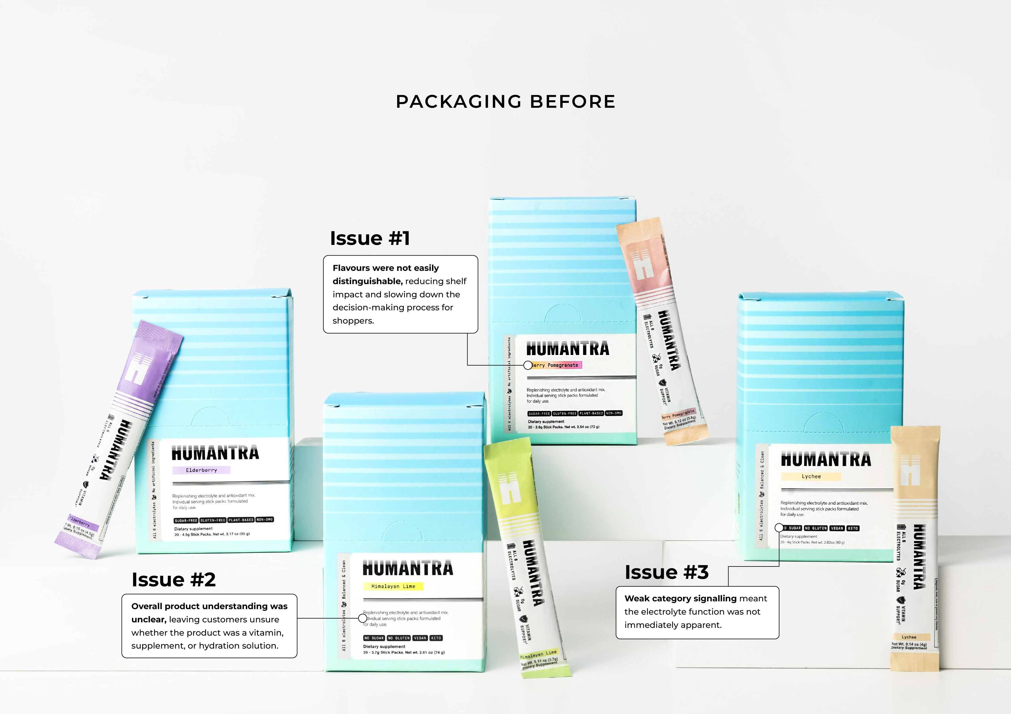
Fix all three problems without touching Humantra's existing logo equity. Every flavour instantly readable. The product identifying itself on sight. The electrolyte positioning unmistakable on shelf.
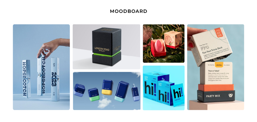
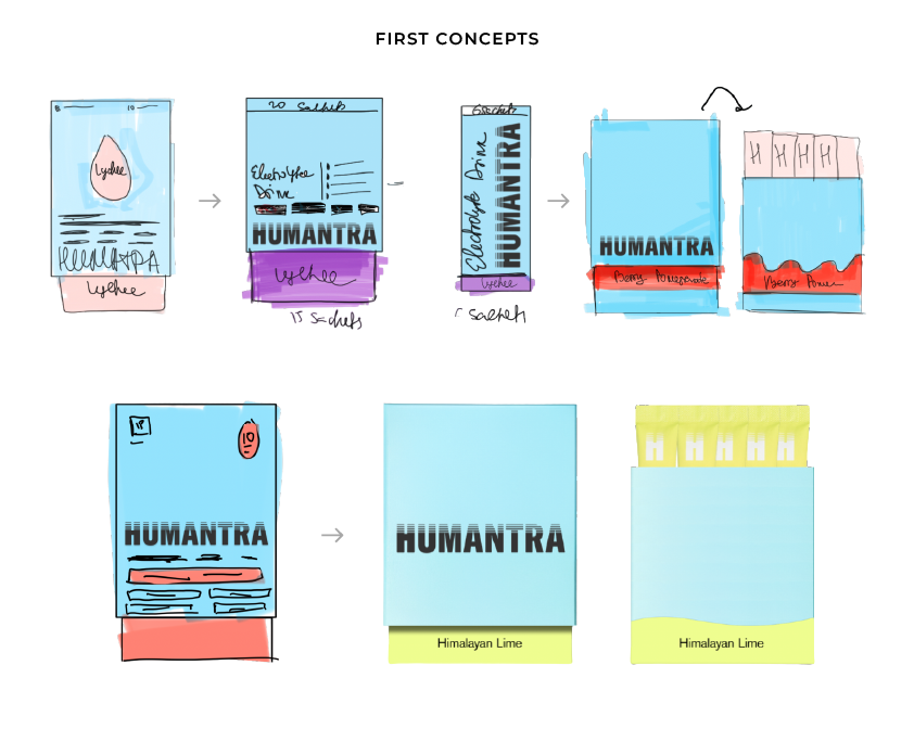
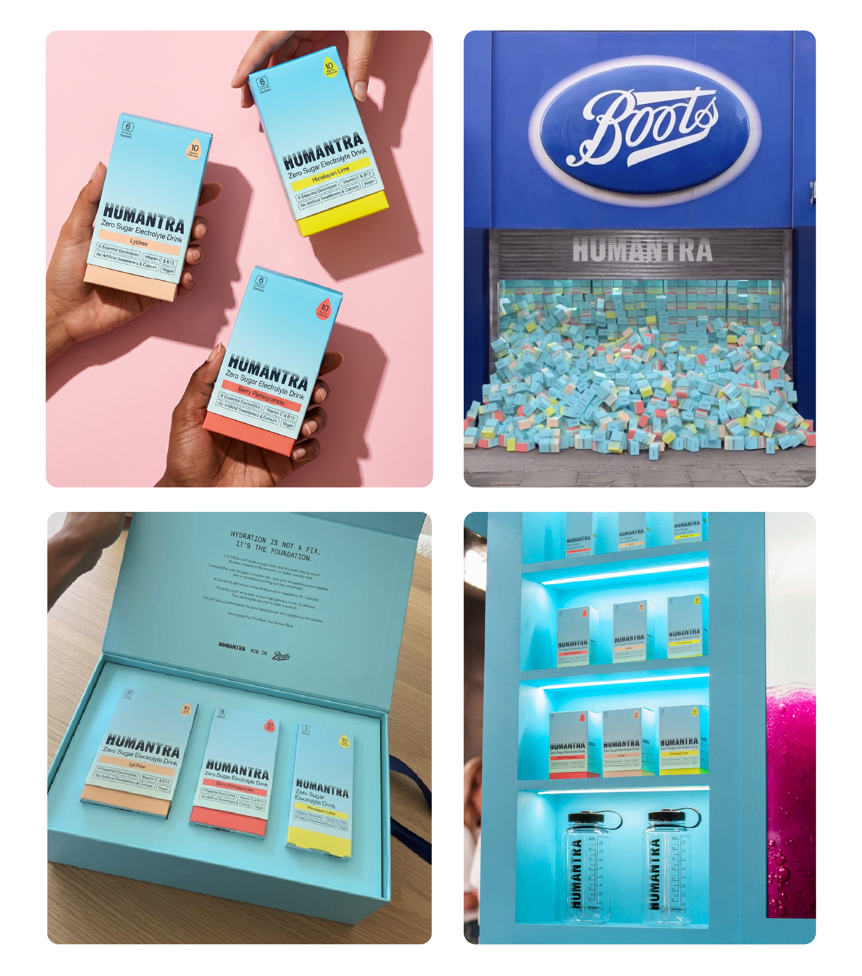
I built a three-point flavour system so each variant reads instantly, no second look needed. I moved the product name up to a secondary focal point, so there's no confusion about what's inside the box. I brought key benefits, electrolytes and vitamins, onto the front of pack, so the product finally claims its category. And underneath it all sits the blue billboard concept: packs designed to line up on shelf and read as one bold wall of color.
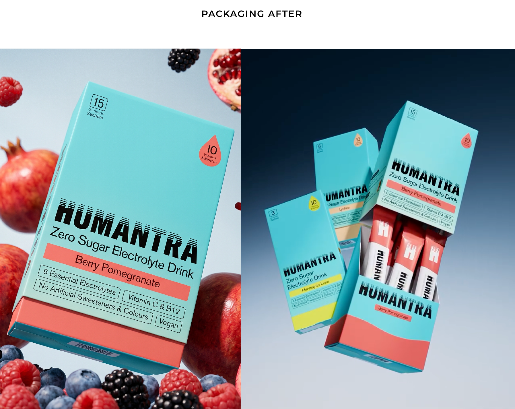

A shared blue foundation with flavour-specific accents. Each SKU distinguishable up close, the full range unified from a distance. Clear hierarchy for naming and benefits, doing the work the old design left to guesswork. The logo stays exactly where it's always lived.


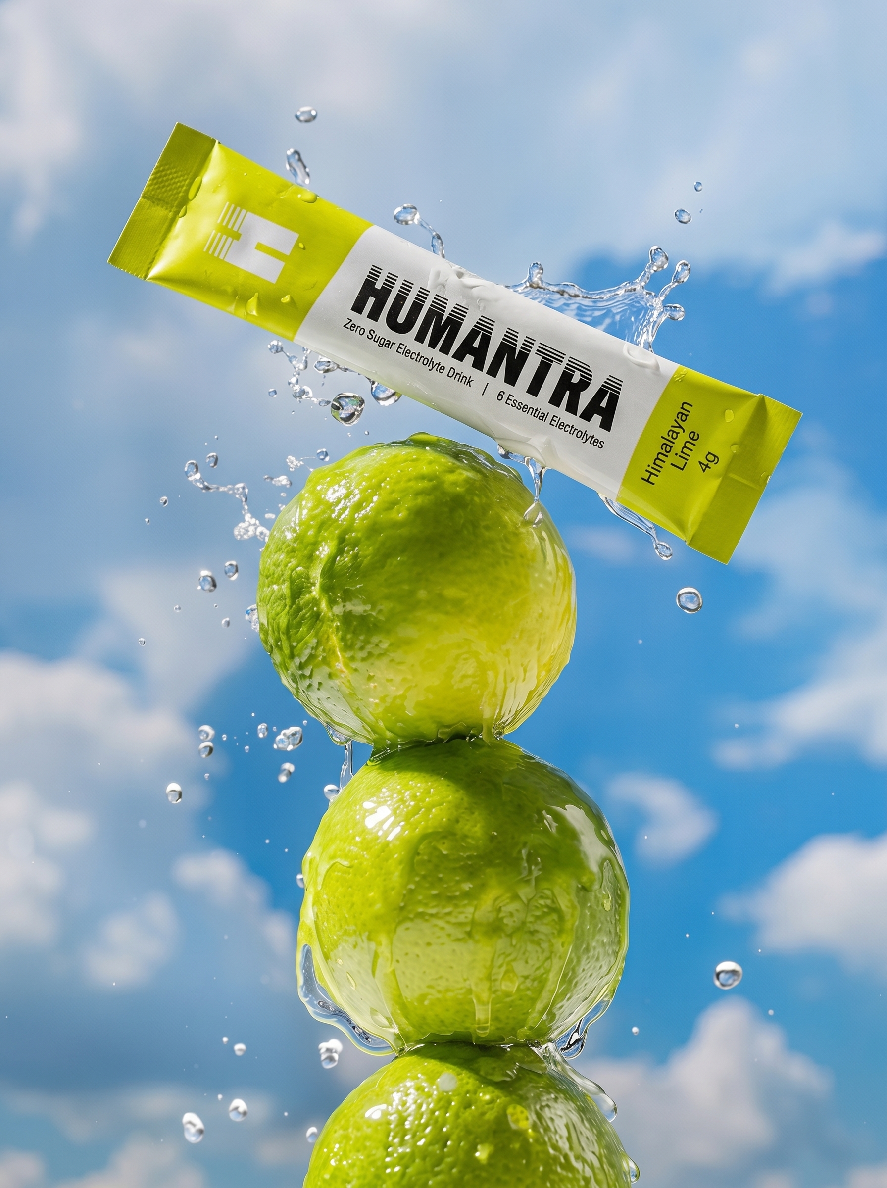
A Limited Edition That Traveled Past One Culture
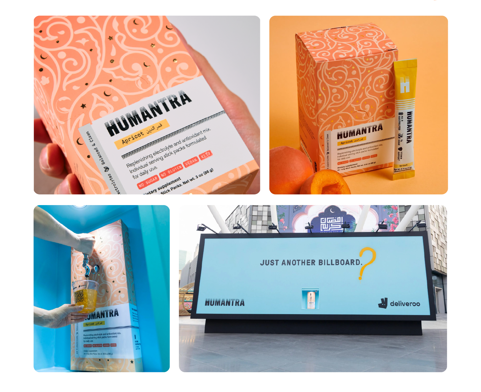
Design high-end, limited edition packaging for Humantra's apricot electrolyte sachets, launched exclusively for Ramadan. It needed to feel seasonal and special, aligned with Humantra's clean, premium visual language. Rooted in tradition, but modern, global, elegant.

Ramadan is visually rich, and easy to reduce to cliché. The real challenge was designing something that captured the spirit of the season without leaning religious, overly traditional, or regionally narrow. It had to feel warm and nostalgic for Ramadan, while resonating globally, Muslim or not.
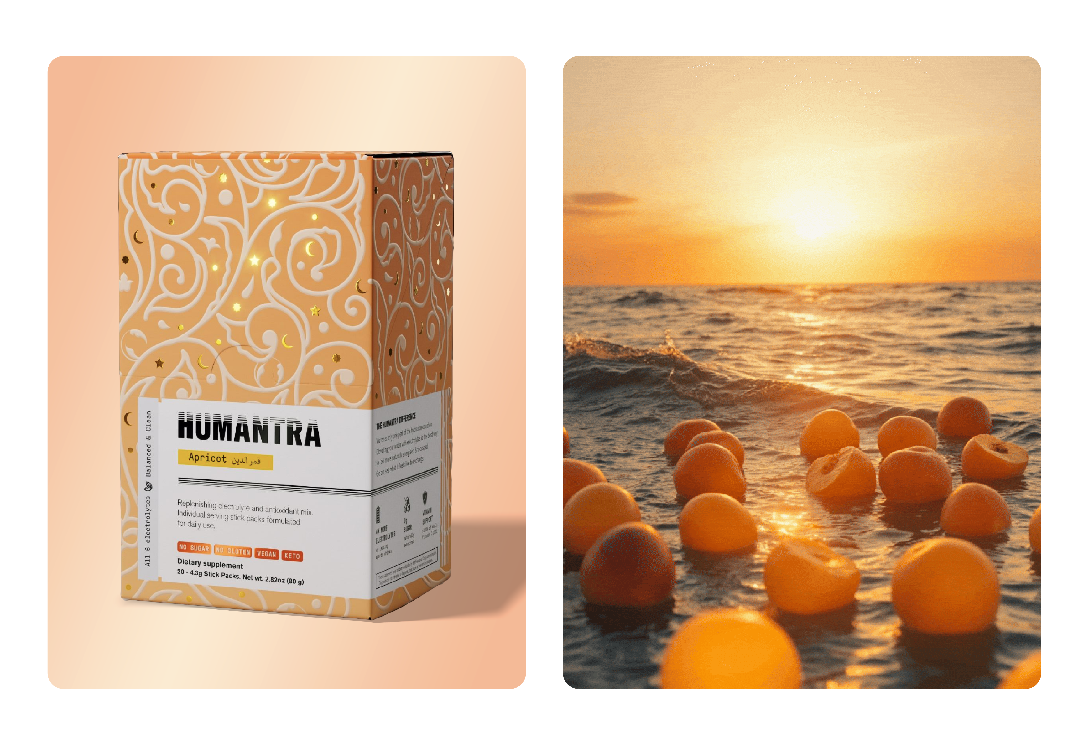
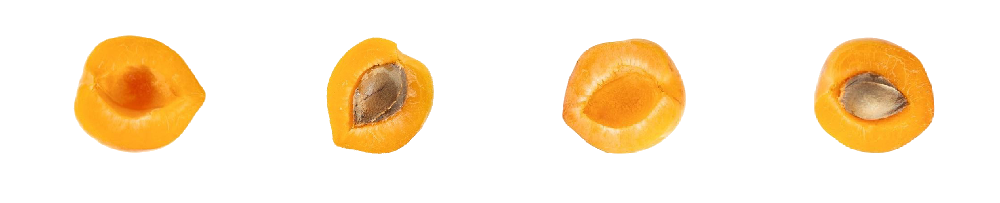
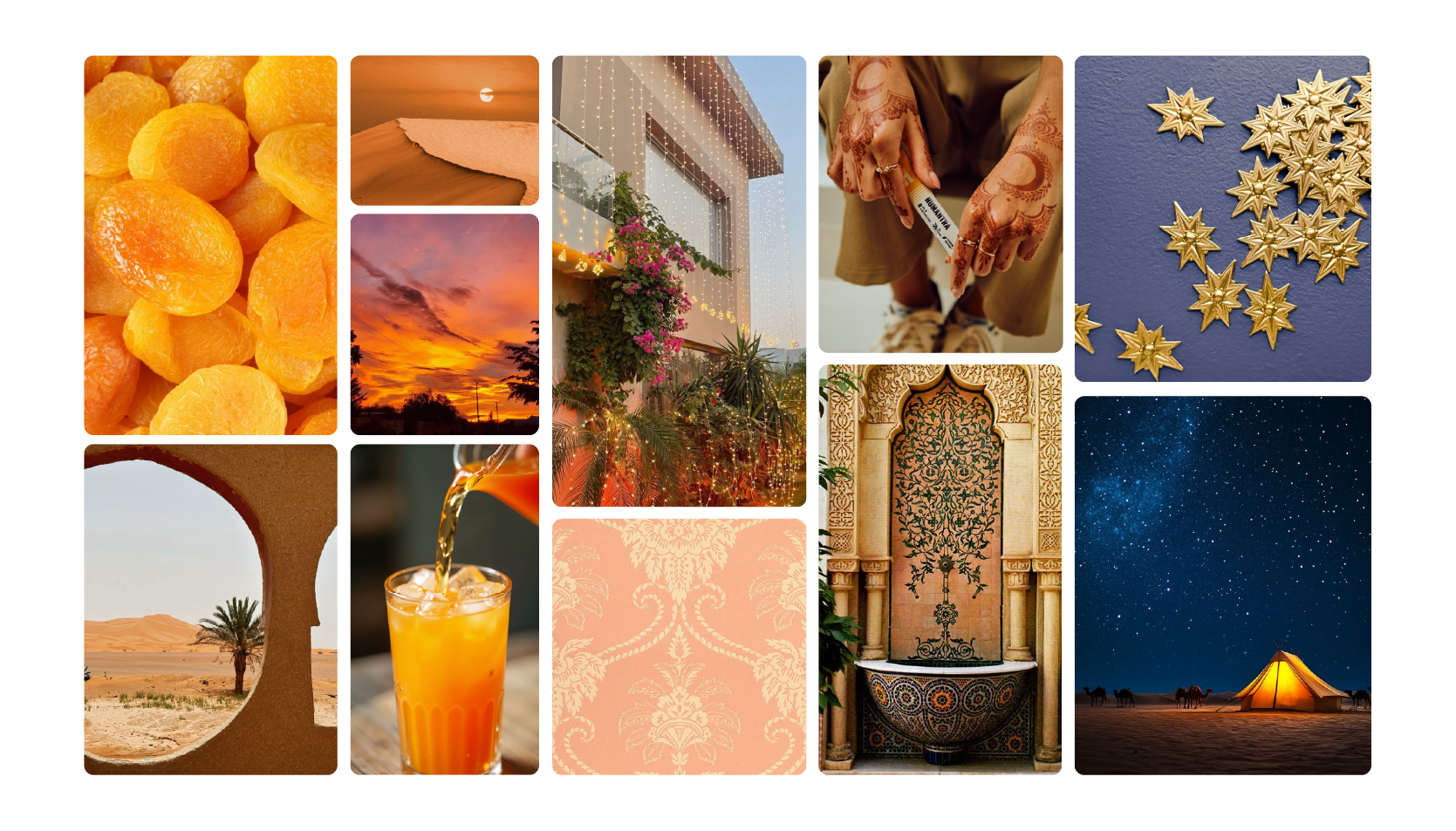
I built an emotional moodboard around the feeling of Ramadan nights: deep apricot tones of dried fruit, the warmth of desert sunsets, intricate tilework, gold accents, soft strung lights. I avoided direct Islamic symbols and leaned into cultural richness instead of religious literalism. The palette combined deep apricot, gold, and warm coral, paired with delicate patterns inspired by Moroccan fountains and Middle Eastern architecture. Luxurious but approachable. Festive but minimal.


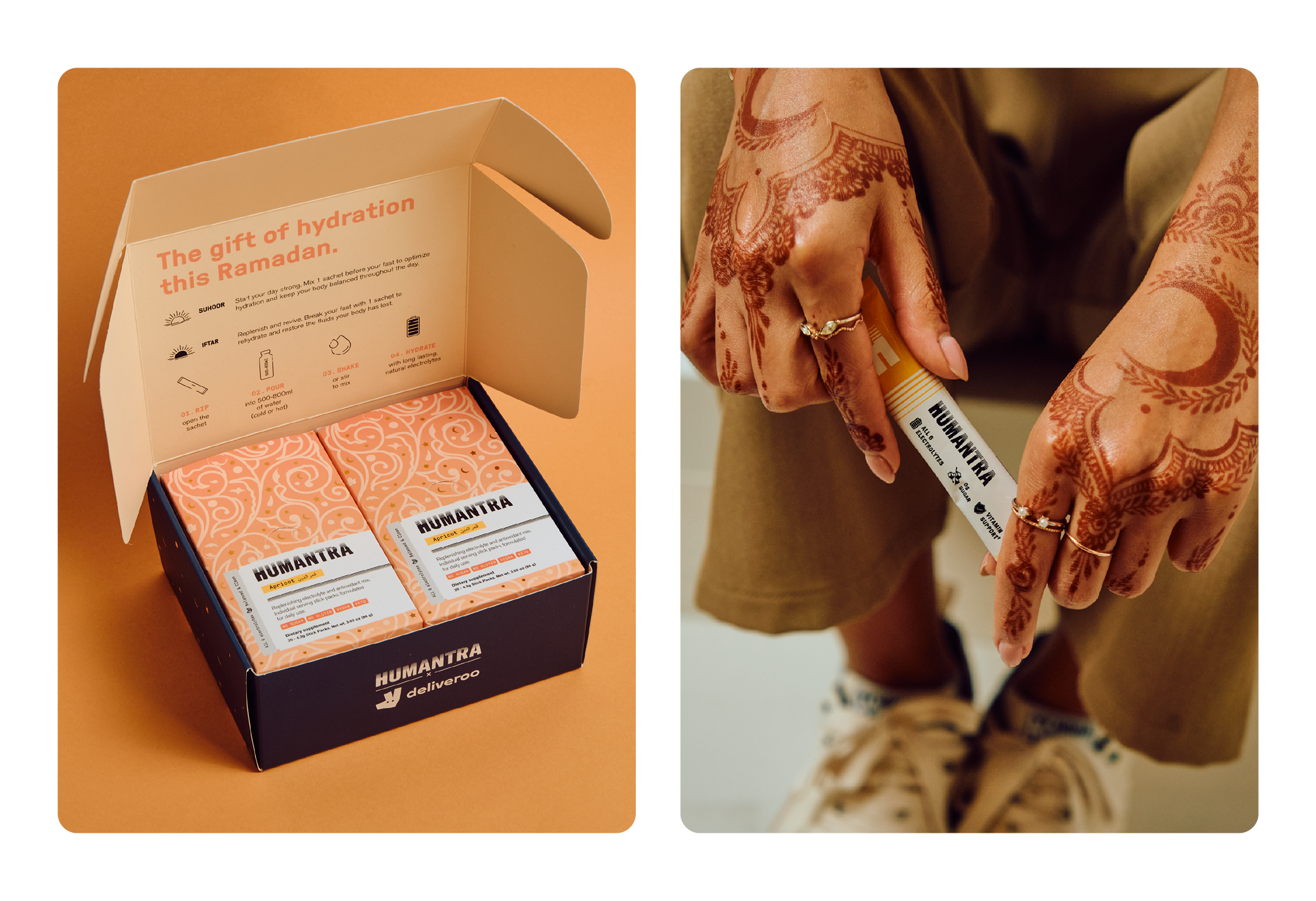
The final pack felt like a collectible. Glowing, golden, textural, a modern take on a timeless tradition. - Sold out globally in just 4 weeks - Gifted to over 300 influencers during Ramadan, with organic shares from creators, wellness bloggers, and even celebrities - Sparked brand love and became a conversation piece during iftar tables and gift exchanges. It was more than packaging, it became part of a ritual.
Brand Identity, Print Marketing Assets, Digital Marketing Assets, Event Branding
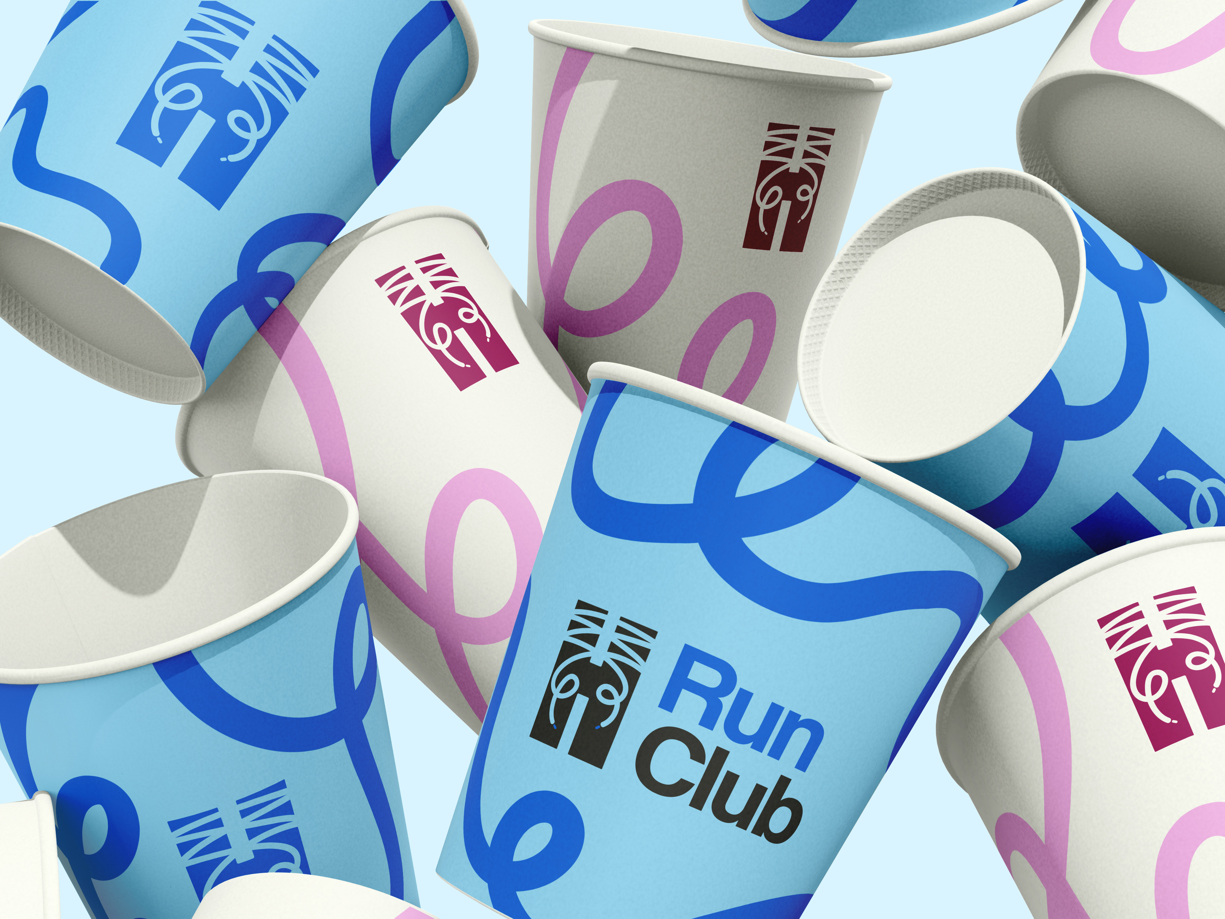
Humantra wanted to extend their brand into the wellness and fitness space by creating a sub-brand for their Run Club. The goal was to design an identity that felt like a natural extension of Humantra, but with its own energy—something bold, social, and movement-focused that could come to life during community events.
The biggest challenge was maintaining brand consistency while adding something new and exciting. How do you evolve an existing logo without losing recognition? How do you create a system that feels energetic and athletic but still premium? Also, typical running visuals (like sneakers and tracks) often feel generic, so the task was to find a fresh, ownable visual hook that would still feel personal to Humantra.
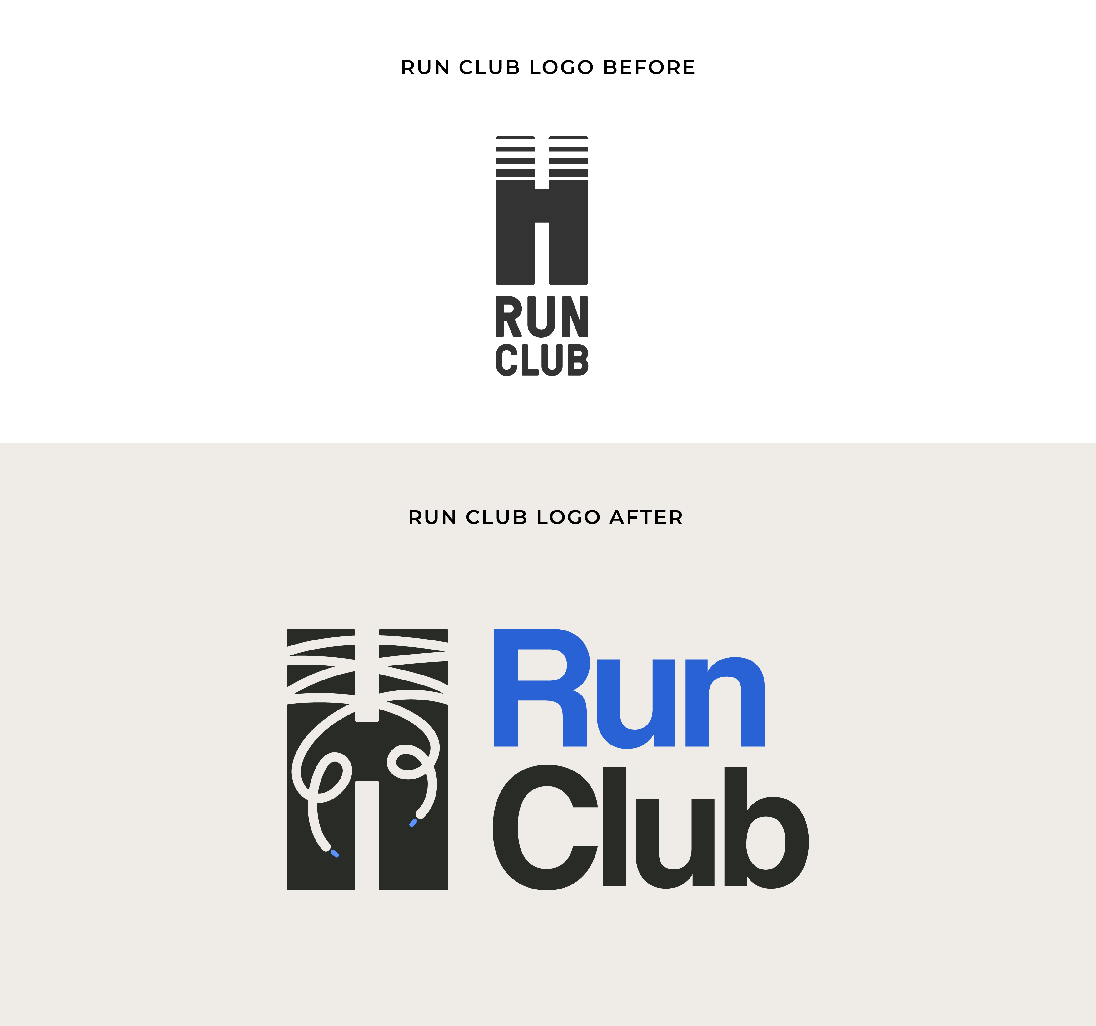
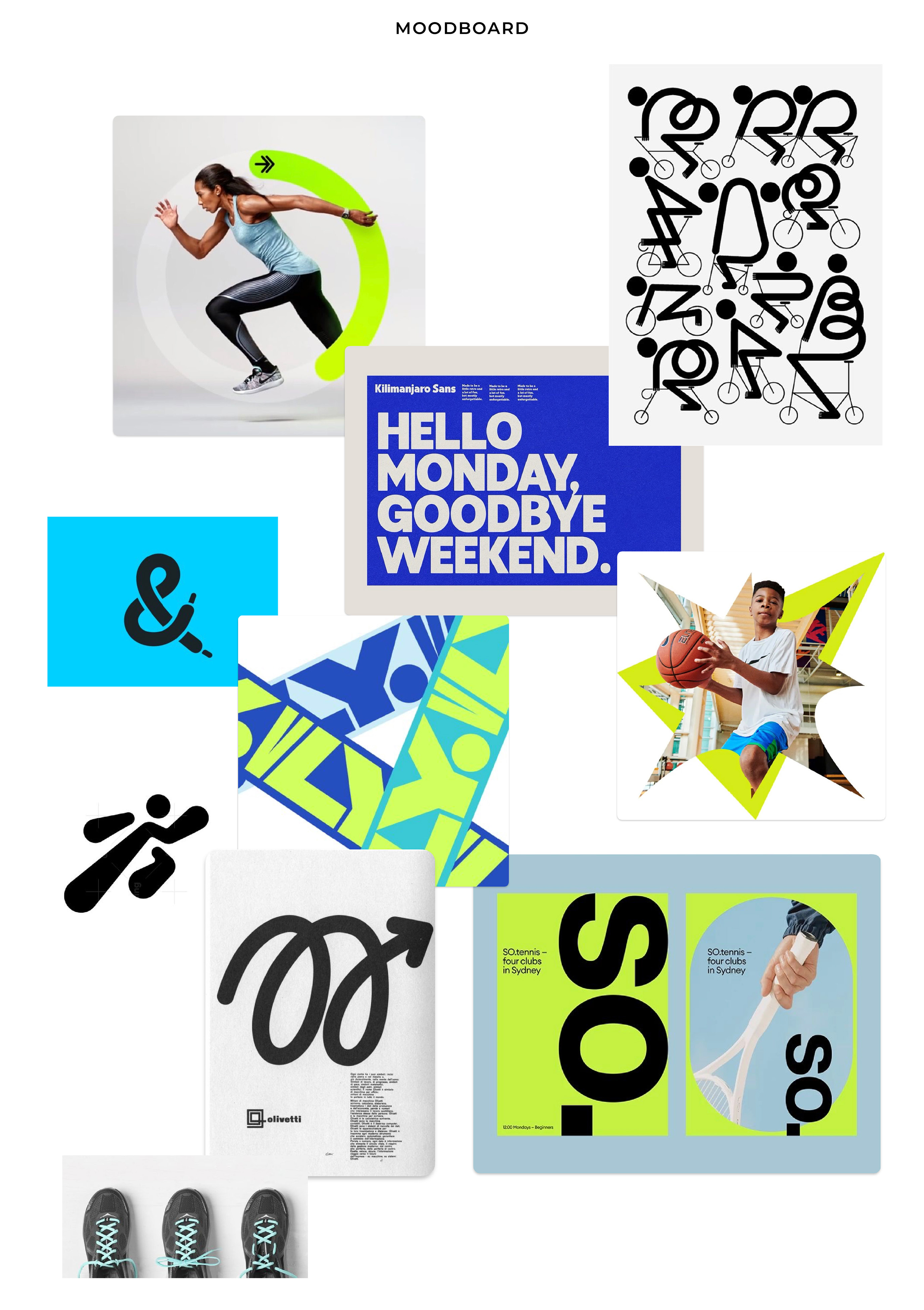
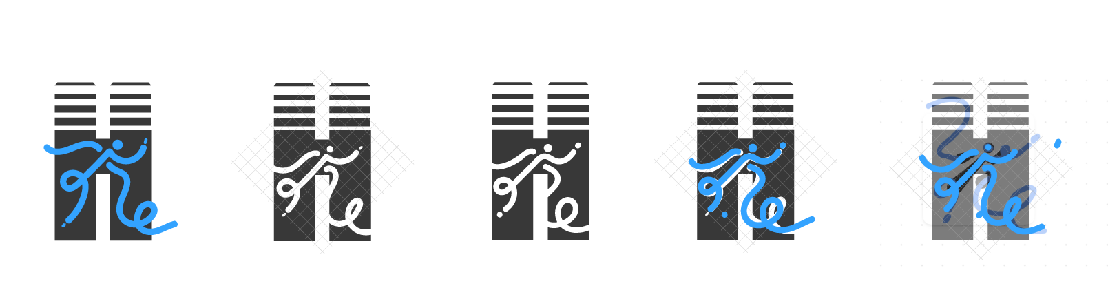
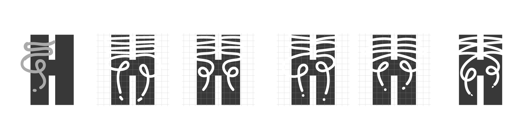
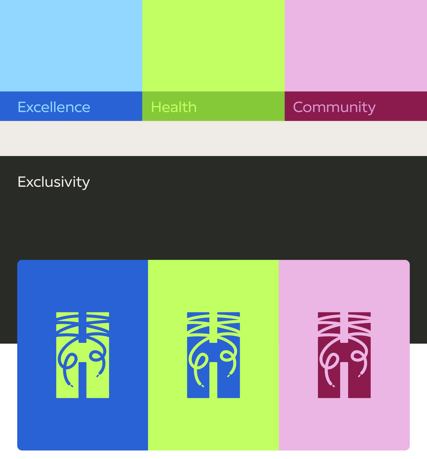
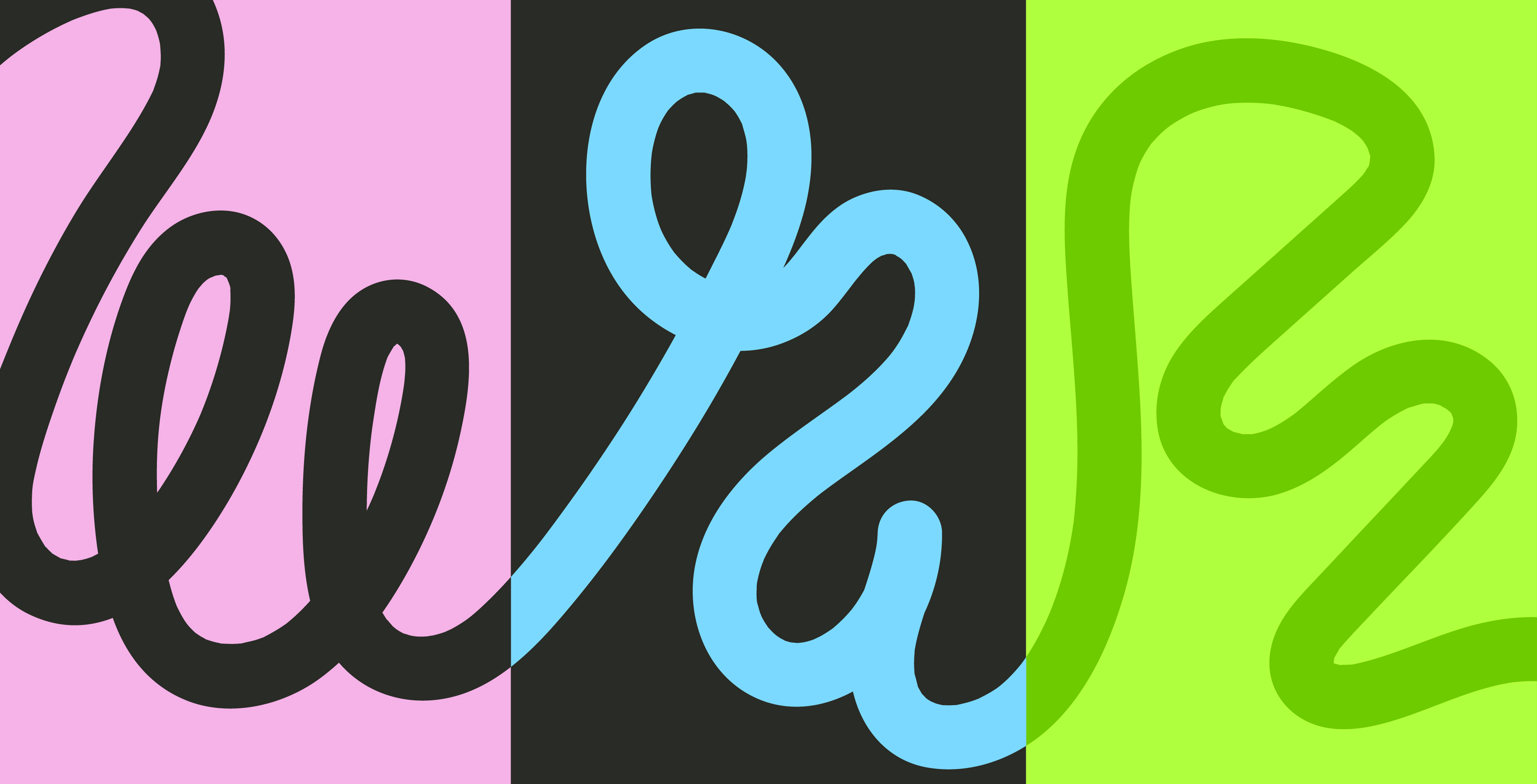
I started by reimagining the logo, transforming Humantra’s signature vertical lines into shoelaces, a subtle but meaningful symbol of running. The laces were hand-drawn to keep the look organic, playful, and full of motion, while preserving the structure of the original logo for brand continuity. For the color palette, I introduced vibrant neons (blue, pink, and green) alongside neutral tones to reflect excellence, health, and community. These colors make the identity stand out at events and create an inclusive but exclusive feel, inviting yet premium. I also designed a full set of event-focused mockups, including meeting point flags, hydration tents, apparel, and accessories, to make the brand interactive and visible in real-world settings. This ensures the Run Club feels cohesive, both in digital spaces and on the streets.

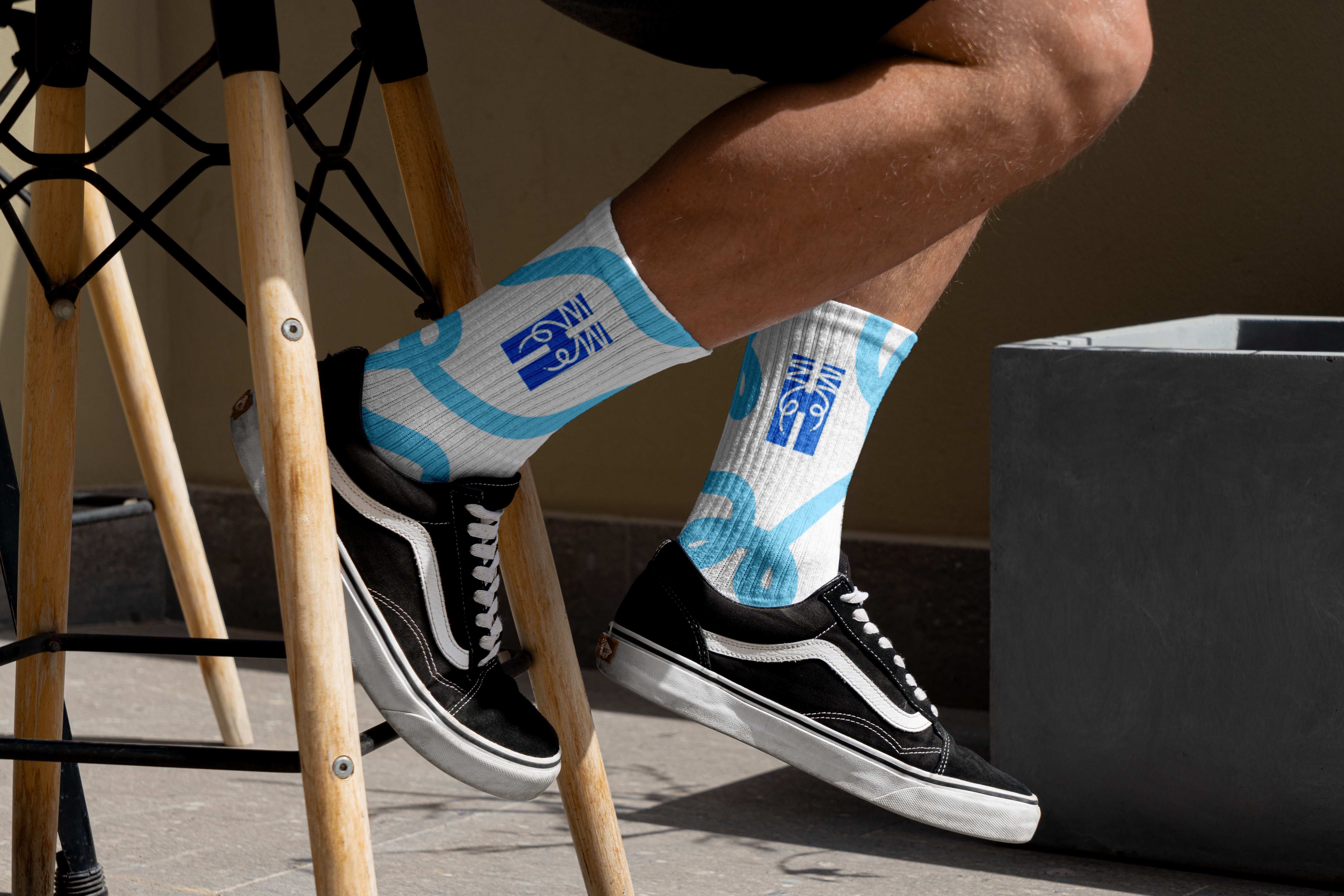
.jpg)
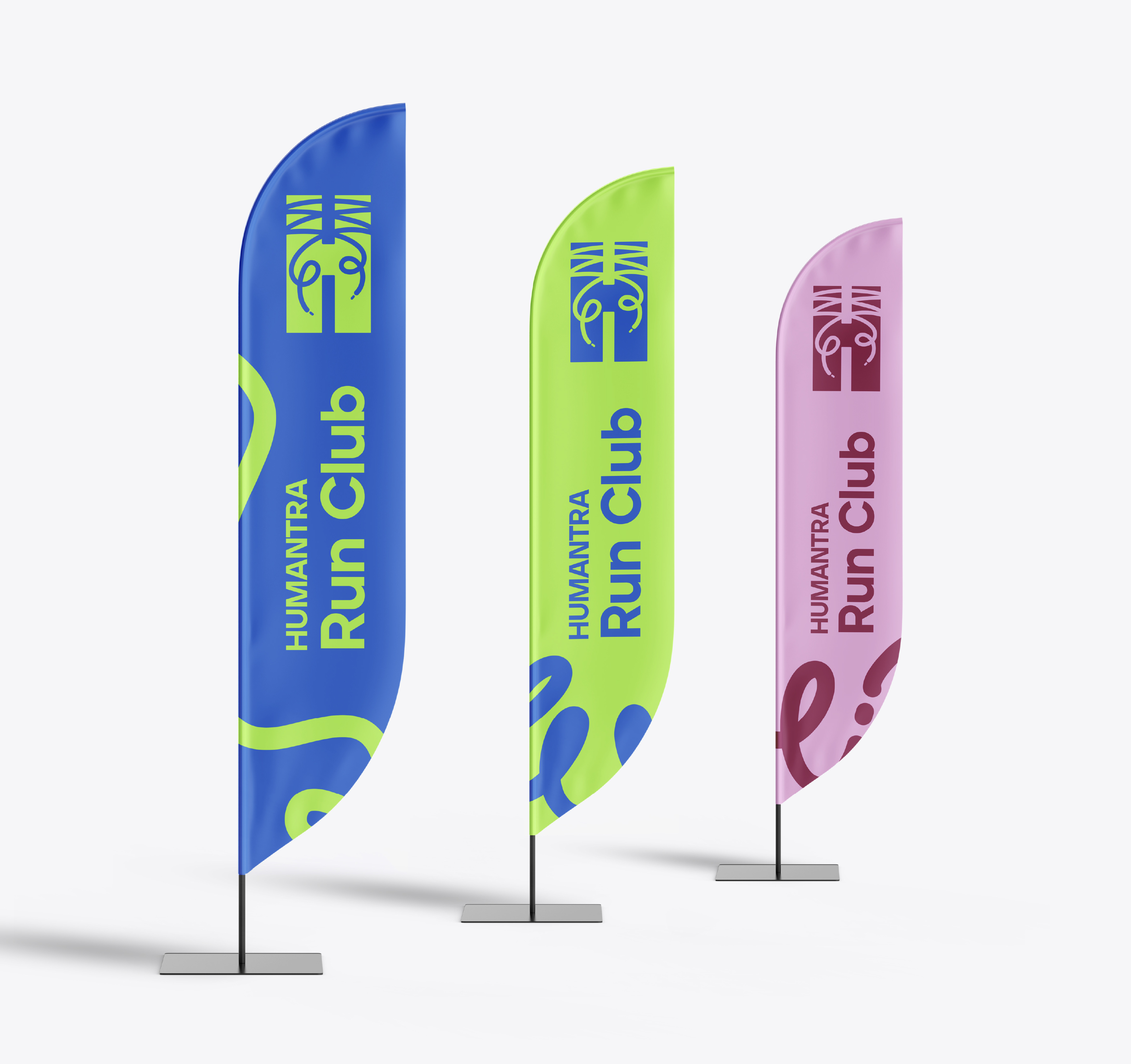
The new Humantra Run Club identity is bold, energetic, and flexible, perfect for community runs, branded events, and wellness collaborations. It successfully bridges Humantra’s premium positioning with the playful, social nature of running culture, building a stronger connection between the brand and its active audience.
Portonovi
