Most product ranges get coloured the same way. Every flavour, every variant, every SKU gets its own bright colour. It photographs well one unit at a time. On a real retail shelf, that approach to packaging design quietly works against the brand.
After 7 years building brand identity and packaging systems for consumer product brands, this is one of the most common things I end up undoing. The instinct feels creative. The result makes the brand smaller.
Here's what's actually happening.
What a shelf actually rewards
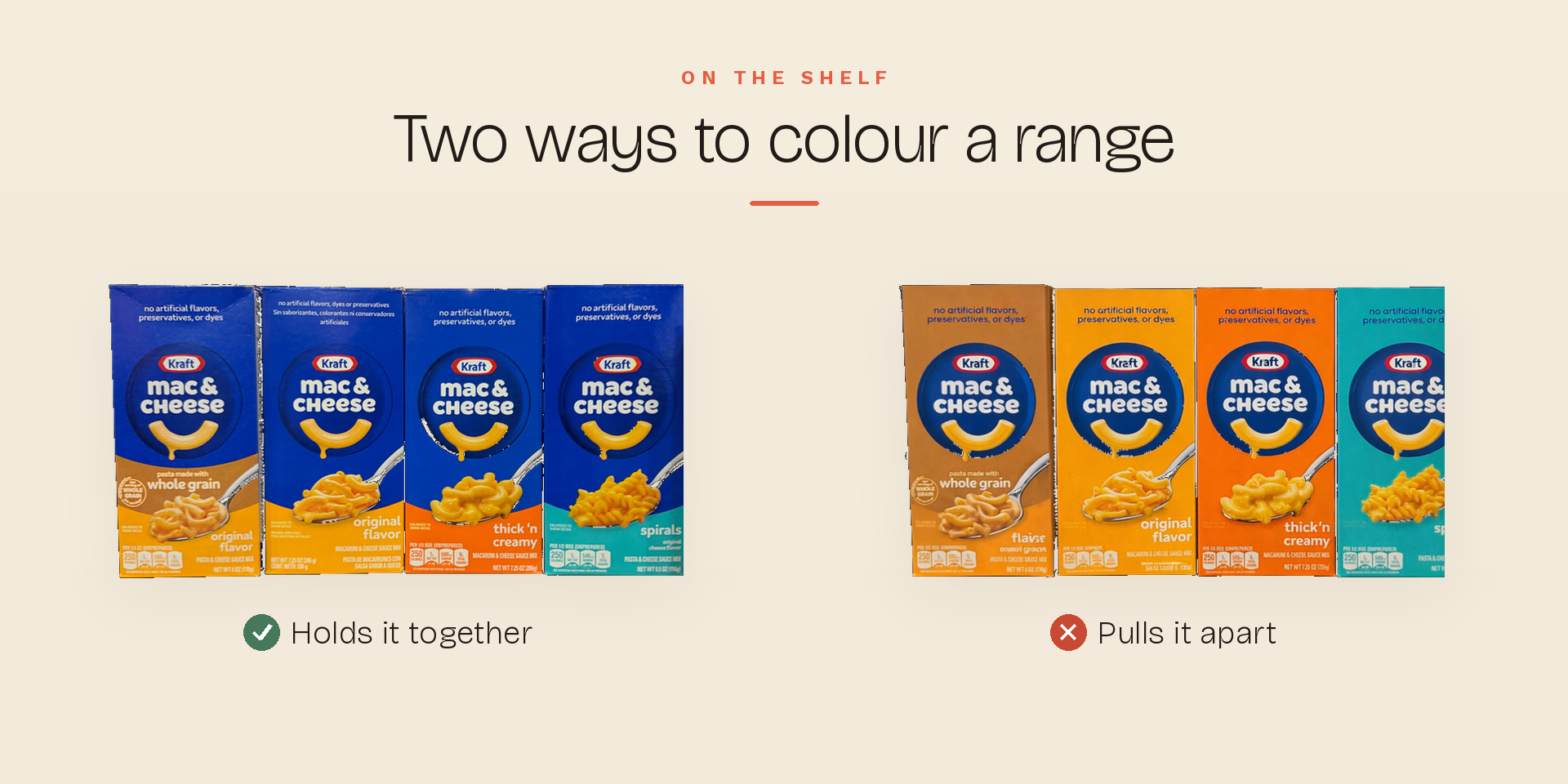
Strong brands don't sit on a shelf as separate products. They group. A wall of one colour reads as one confident brand taking up space, and your eye clocks that before it reads a single word.
That grouping has a name in packaging design: the brand block. It's the colour and layout your range shares, the thing that lets a customer spot you from across the aisle and think, without deciding to, that brand is everywhere.
We notice what looks big. We trust what looks established. We reach for what feels familiar. None of that is about the single pack. It's about the block.
Where rainbow packaging breaks down
Give every variant its own dominant colour and the block falls apart. Each pack is now its own little island, fighting for attention on its own, with no help from the ones beside it.
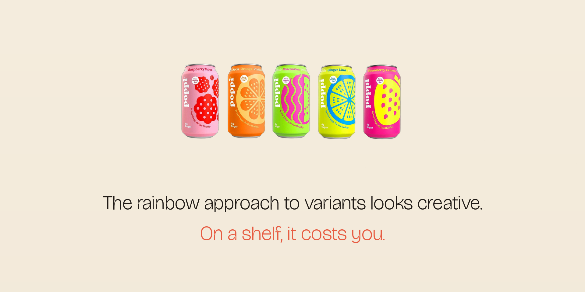
Think about a bright, every-can-a-different-colour drinks range. Gorgeous in isolation. Put it on a crowded shelf where everyone is already shouting in bright colours, and it dissolves into the noise. There's nothing holding the range together as one recognisable thing.
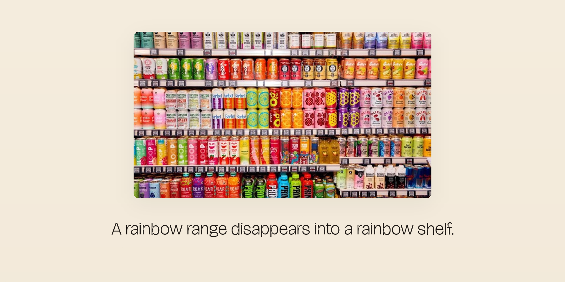
The brands that own their aisle
Now picture two brands in the same category, side by side. One runs a different look on every pack. The other holds a single colour across the whole range. From three steps back, one of them reads as a brand and the other reads as clutter.
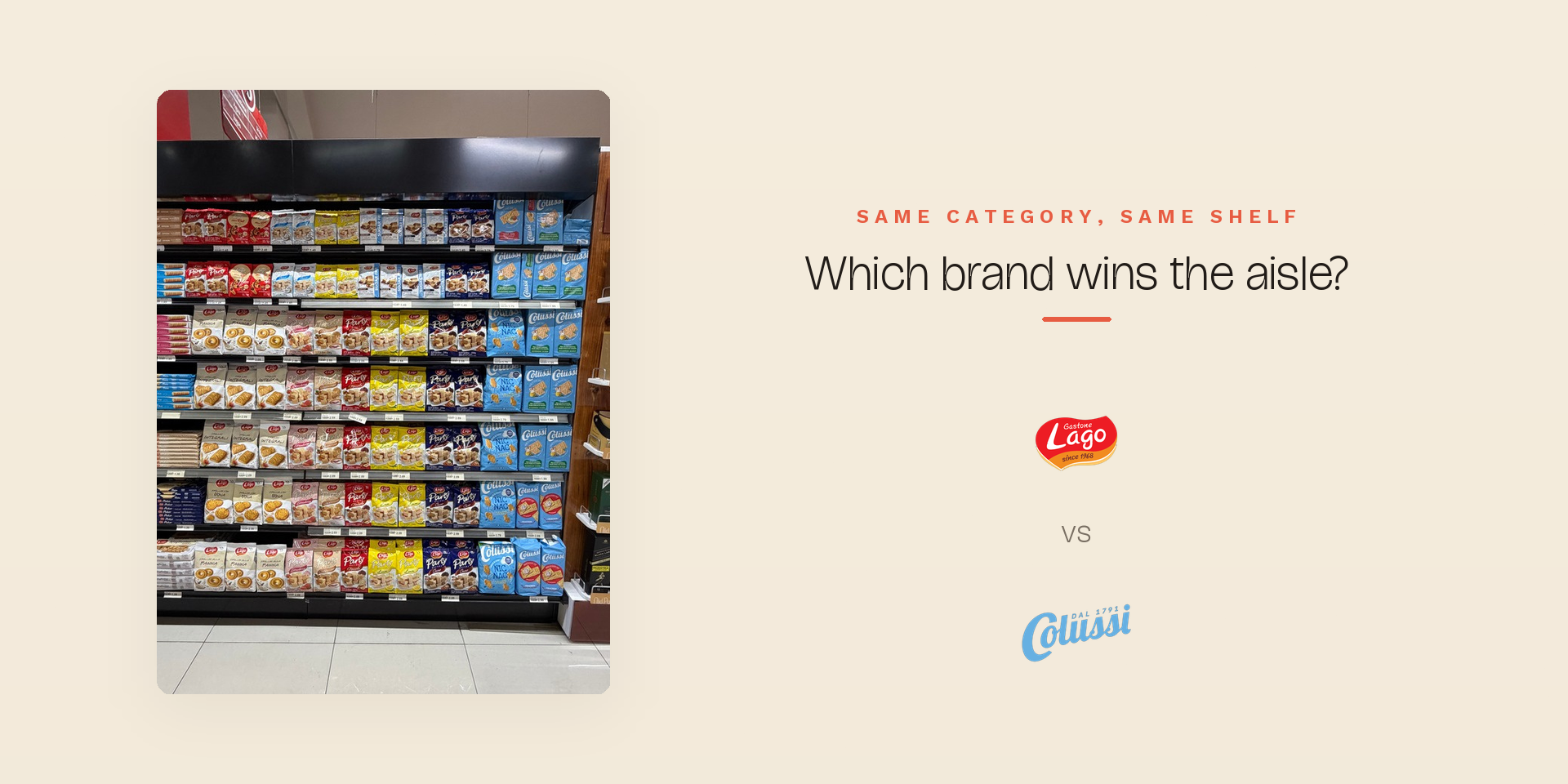
The unified one wins the glance almost every time. That recognition is doing the quiet work of making the brand feel bigger and safer than whatever sits next to it. It's the whole argument for treating colour as a brand identity decision, not a per-flavour decoration.
Why marketers and designers both reach for more colour
The pull toward a rainbow comes from two directions. Marketers reach for more colour because it looks like more choice on the shelf. Designers reach for it because it looks like more range and more expression.
Both are understandable. Both, left unchecked, shrink the brand.
The hidden cost of rainbow packaging for a small brand
This is the part nobody prices in when they sign off a colourful range.
If you're a household name, you can absorb a bit of fragmentation. People are already looking for you. A smaller brand doesn't have that cushion. You're fighting for the glance in the first place. Split your range into five different colours and you've taken your one advantage, showing up as a unified block, and handed it back.
I've watched this on real briefs. A founder falls in love with a palette where every scent or flavour gets its own colour. It's a lovely mood board. Then you mock it up the way it will actually sit on a retail shelf, six units across, three rows deep, next to the competition, and the brand vanishes into its own variety.
How strong brands build a packaging system that holds together
The fix isn't one flat colour with no variation. Customers still need to tell the flavours apart at arm's length, fast.
The brands that get this right run two systems at once. One unifying brand element that never changes, usually a dominant colour, that holds the whole range together as a block. And one clear variant cue, a flavour band, an illustration, a single colour accent, that changes per SKU so nobody grabs the wrong one.
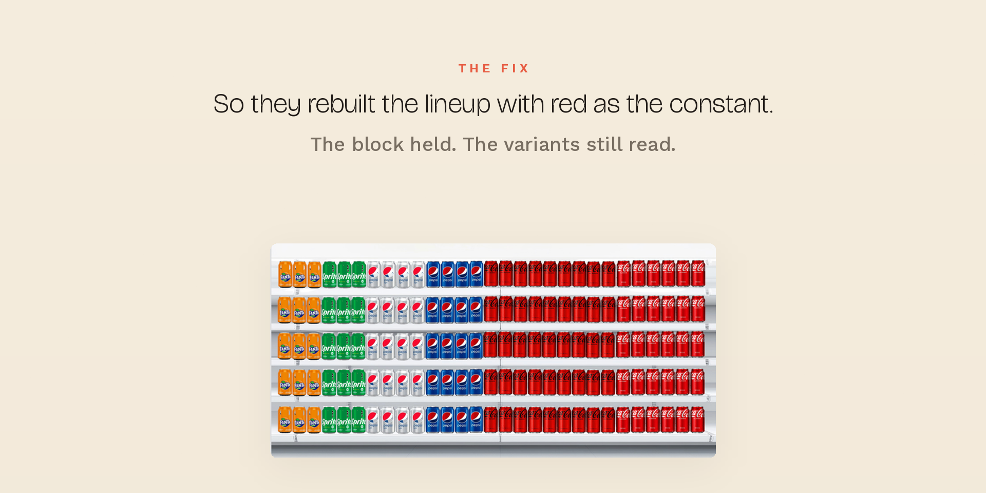
Coca-Cola is the textbook case. As Coke Zero grew, the familiar red wall started to thin out across the fridge, and the brand began to lose its grip on the aisle it used to own.
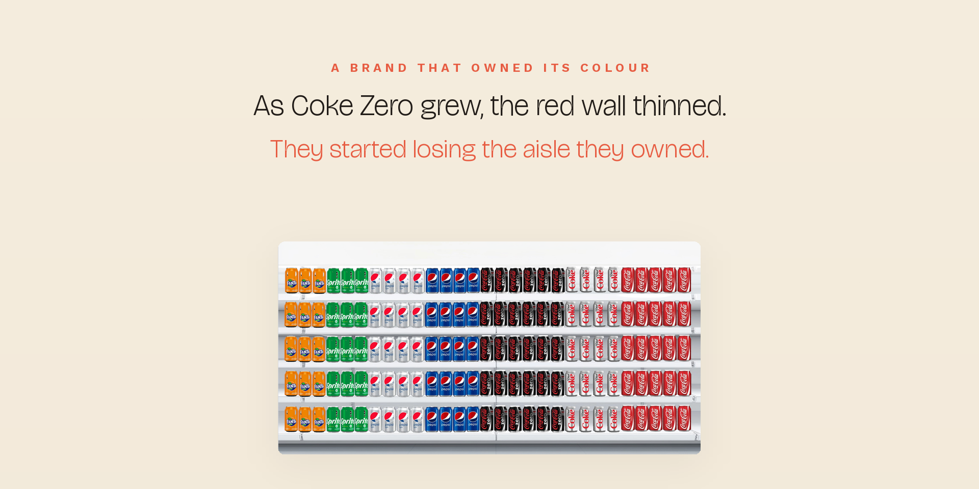
The response was to bring red back as the constant across the whole lineup, with each variant distinguished inside that red rather than breaking away from it. The block held. The variants still read. That's a packaging system doing its job.
On my own work this is the decision I protect hardest. On the Humantra retail packaging range built for a Boots UK launch, every flavour has its own identity, but the pack is unmistakably Humantra at a glance. The variant cue earns its place without ever being allowed to break the block.

Brand recognition first, variant clarity second
If there's one rule to take from this, it's the order of priority.
Brand recognition first. Variant clarity second. Design the block so the brand is seen, then solve for telling the variants apart inside it. Do it the other way round, lead with variant expression, and you optimise for a problem the customer only has after they've already found you.
If you're not seen, you're not chosen
The sequence on a shelf is simple. If you're not seen, you're not chosen. And nothing else on the pack, the formula, the founder story, the price, gets a chance to matter until that first thing happens.
So the real question for any range isn't which colours to use. It's whether all those colours are building one brand, or quietly breaking it into pieces.
Before you brief a designer
If you're looking at your range and not sure whether it's holding together as a block or fragmenting on the shelf, that's exactly the kind of thing a shelf-ready packaging review sorts out quickly. Get in touch here and we'll look at it together.