Brunch Junkie
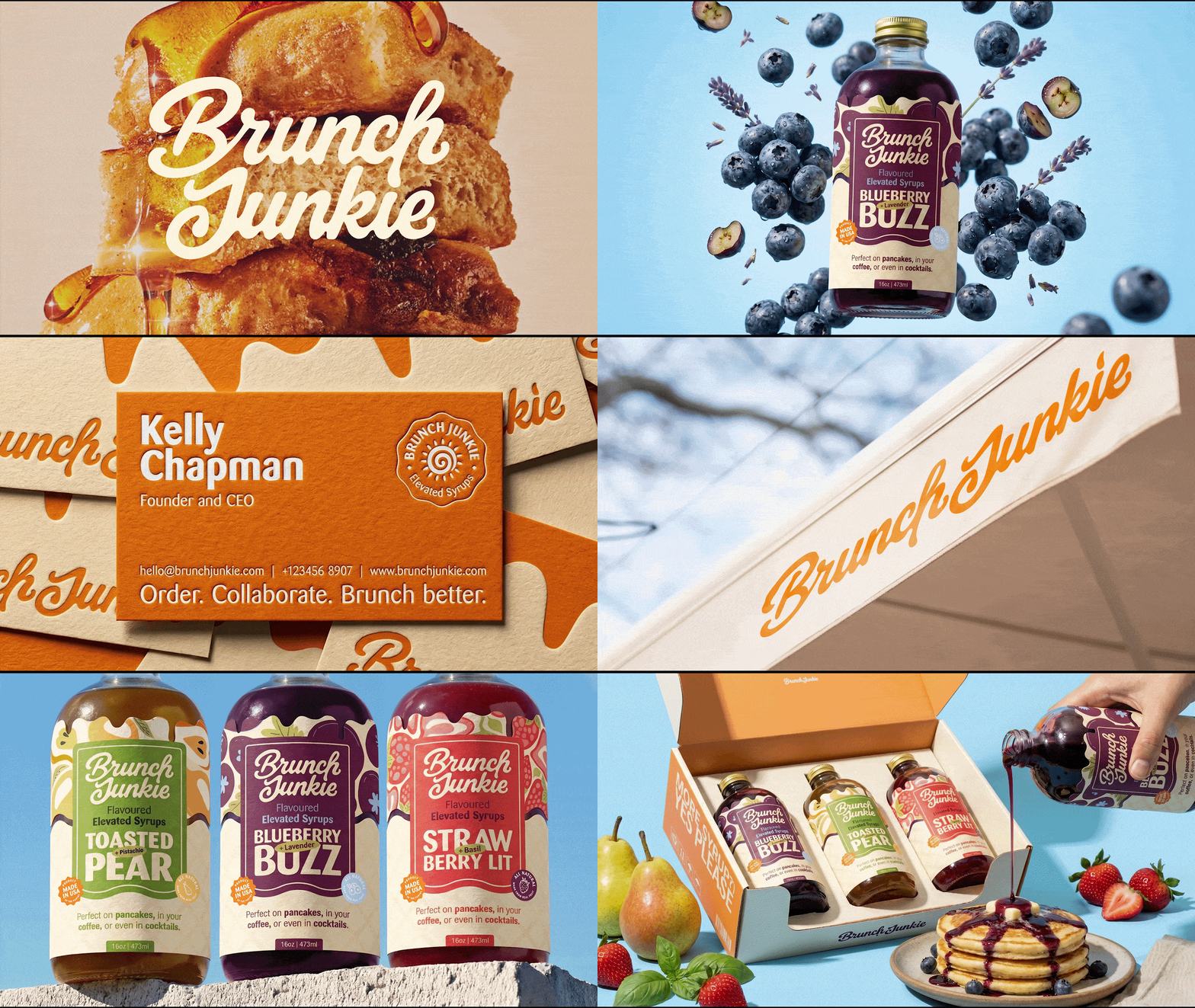
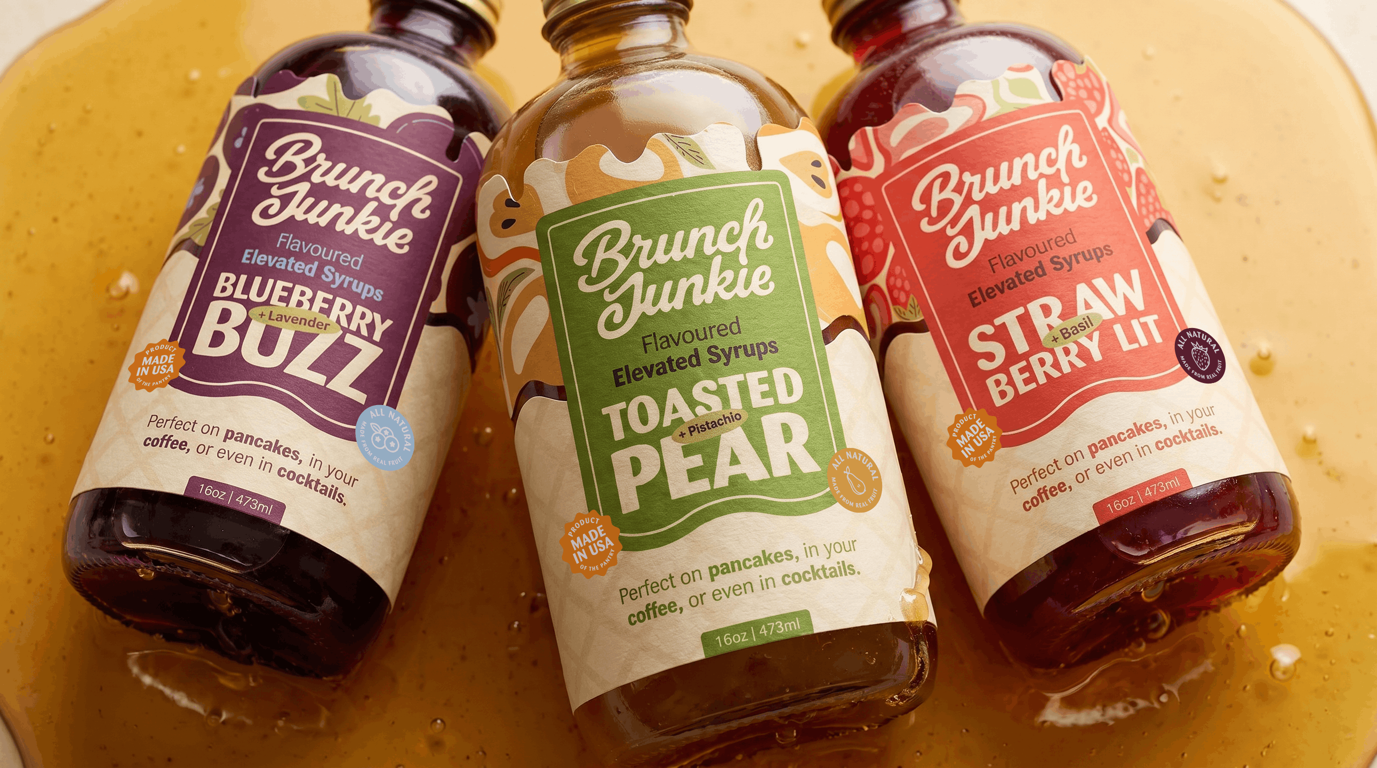
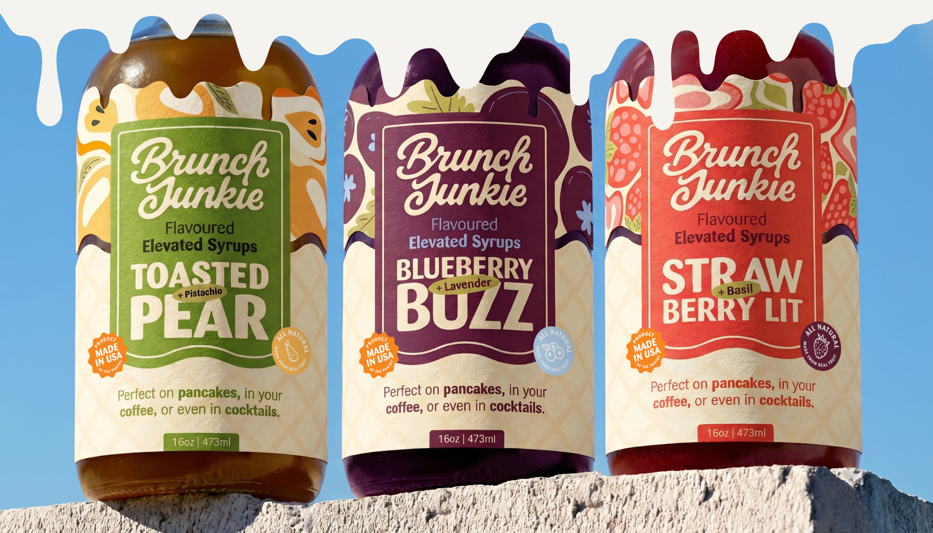
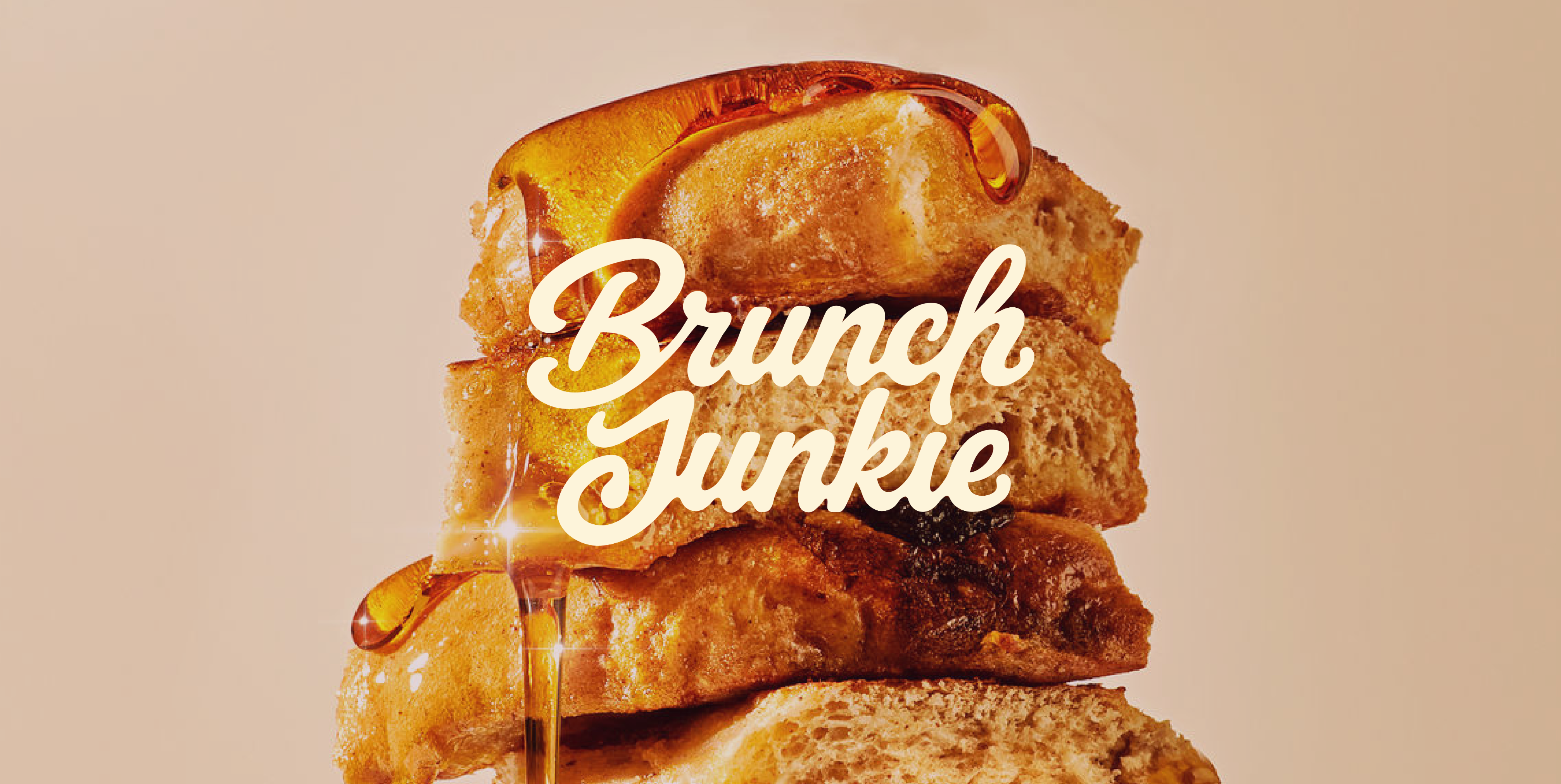
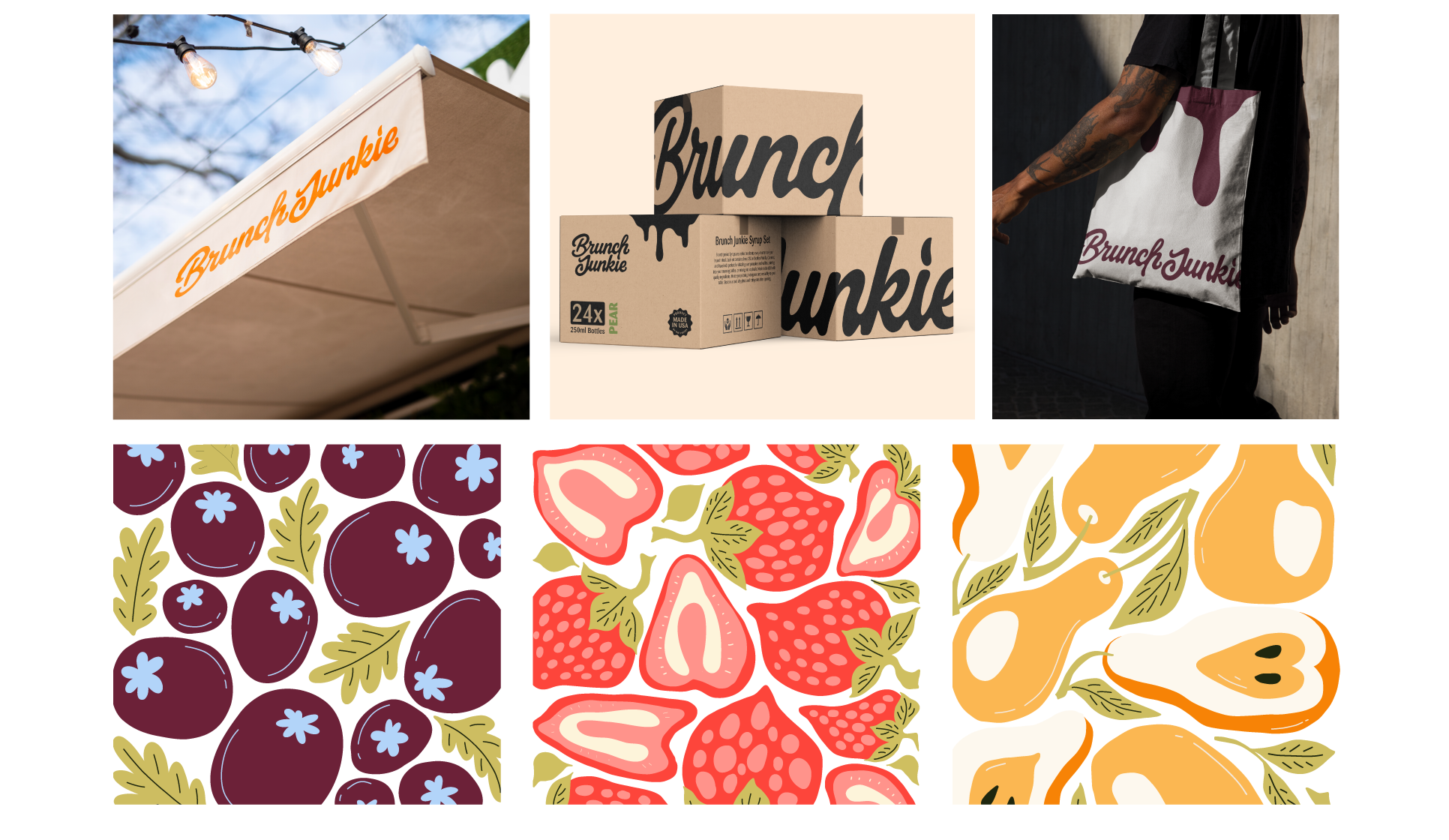
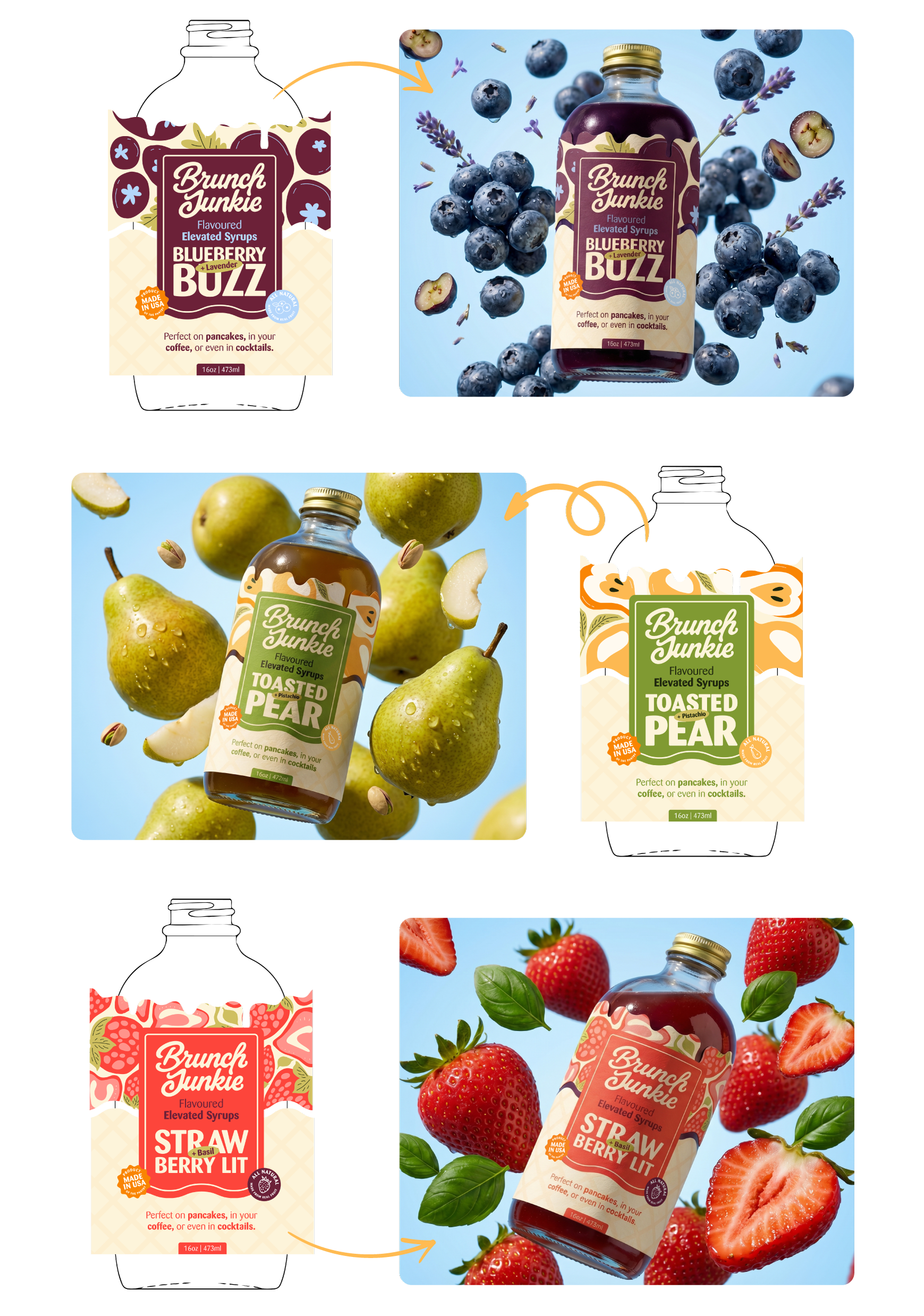
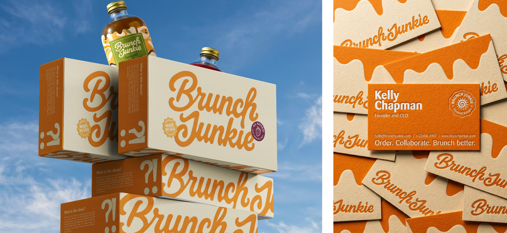
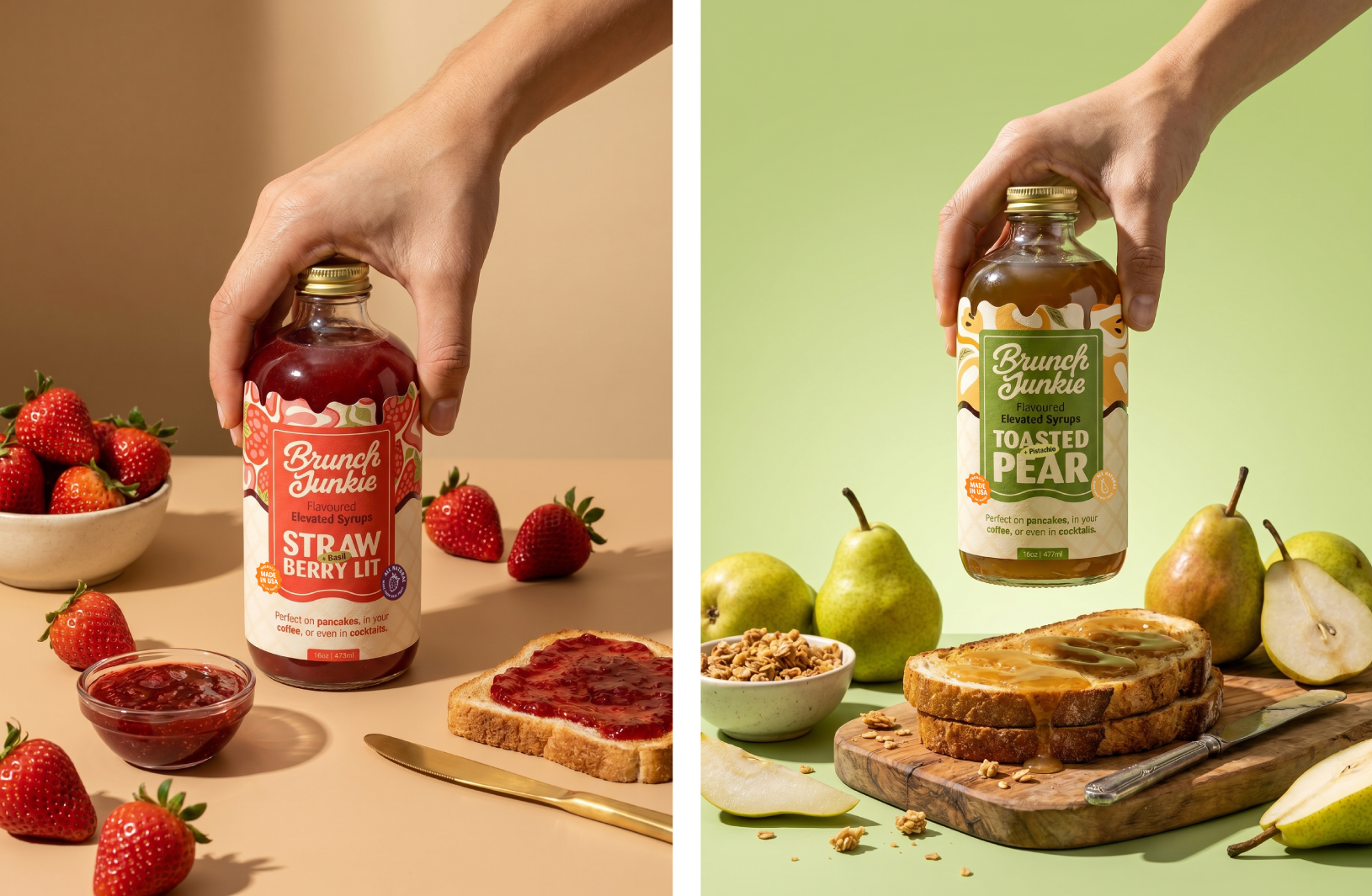
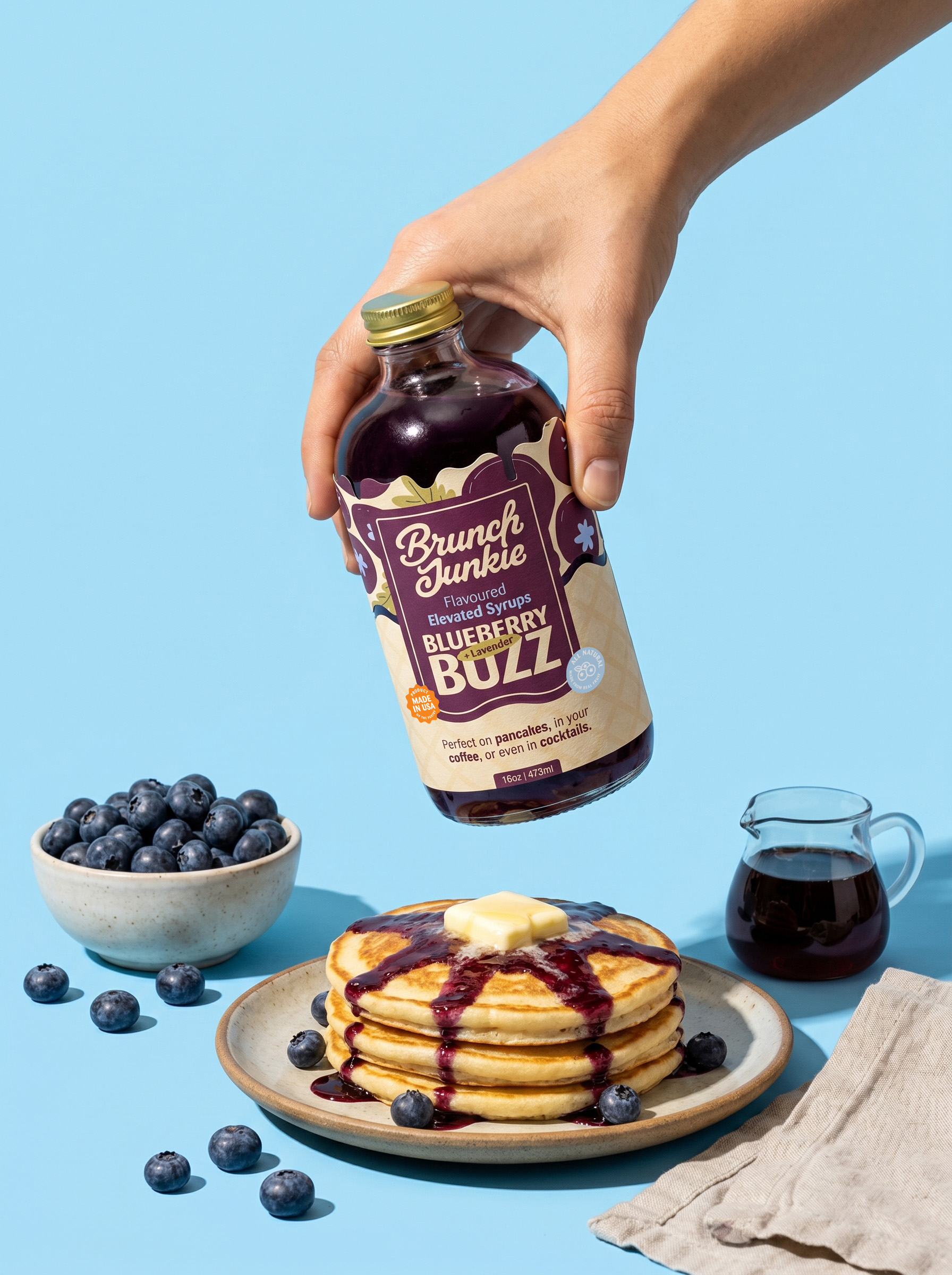
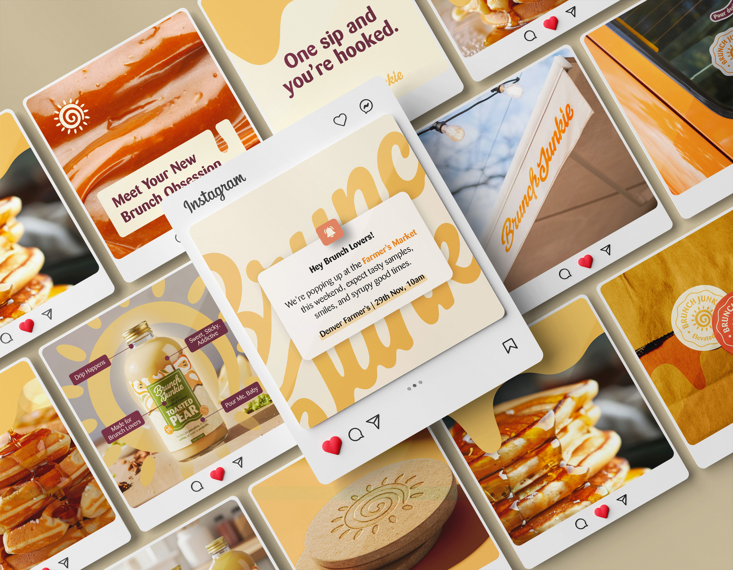
A full brand system from the ground up. Starting with brand strategy: foundations, mission, vision, values, two target audience profiles, competitor analysis, brand voice and personality, and creative direction. From there, a complete visual identity: logotype, submark, colour palette, typography, and illustration system. The project finished with packaging design across 3 SKUs, including print-ready files and dielines.
ABOUT THE BRAND
Brunch Junkie is a small-batch, all-natural syrup brand born in Denver, Colorado, built on a simple but bold belief: maple syrup shouldn't be the only option at the table.
The brand makes flavoured syrups crafted from real fruits and herbs. Its mission is to turn an ordinary weekend breakfast into a ritual worth looking forward to, something slow, indulgent, and shared with the people you love.
The brand speaks to two audiences: the at-home bruncher, a busy professional in her 20s to 40s who craves something special on weekends without the fuss of a full recipe, and the hospitality buyer, a café owner or bar director looking for locally made, story-driven ingredients that make their menu stand out.
THE
FLAVOR
JOURNEY
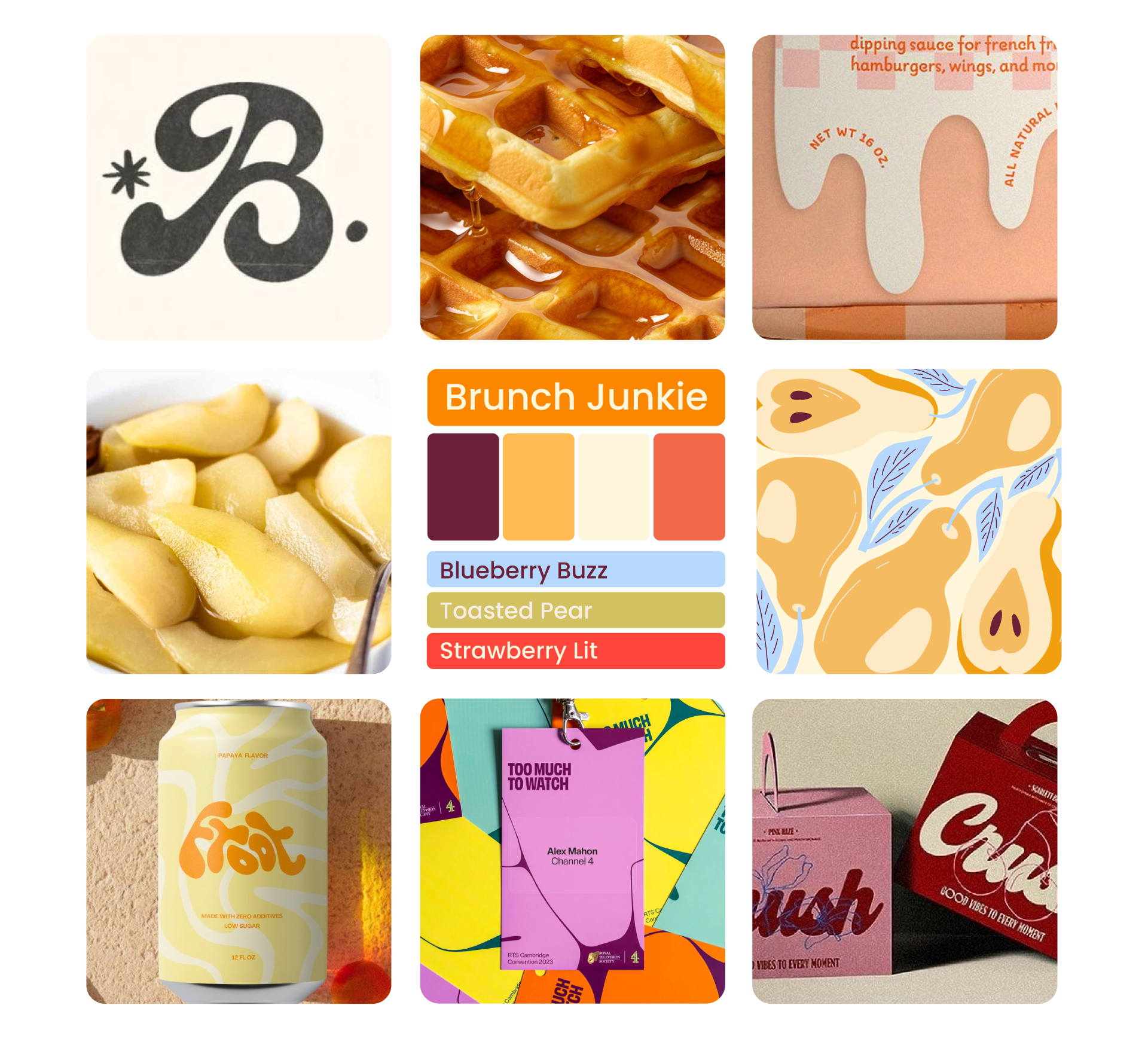
Moodboard
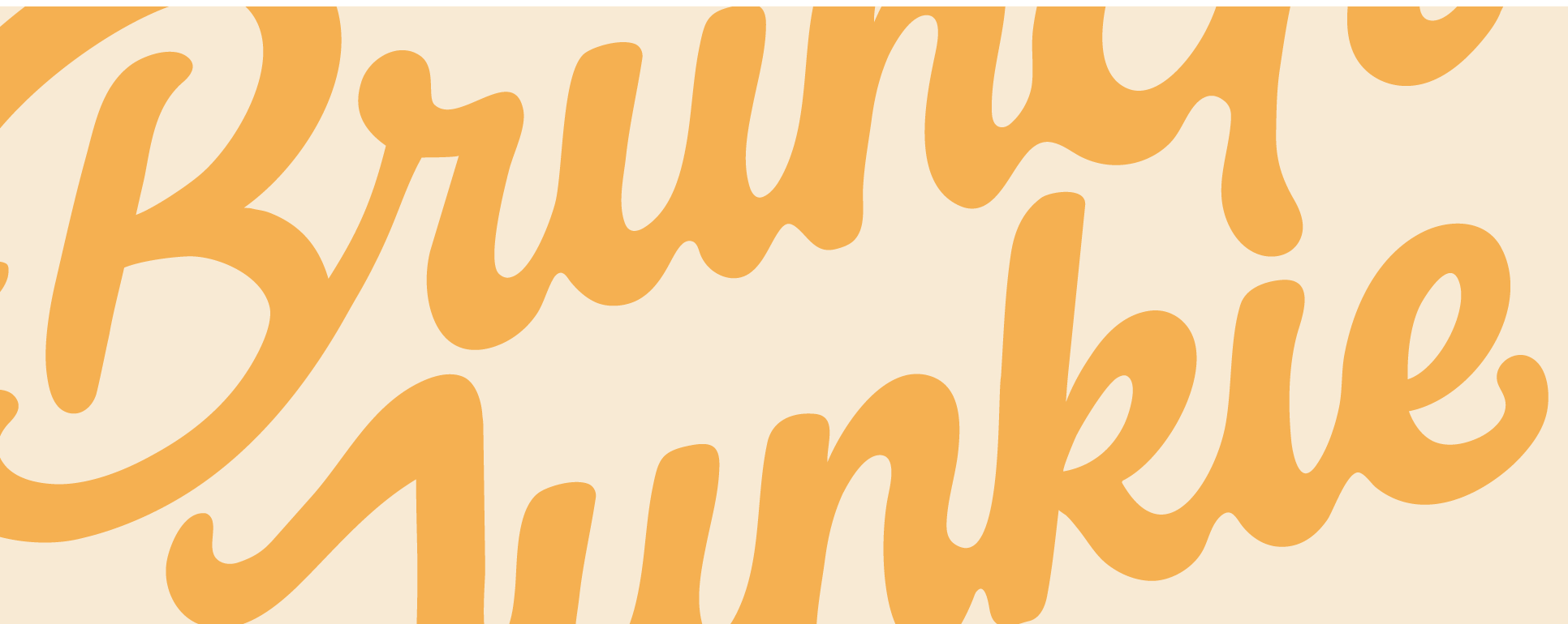
This is the creative direction that guided every visual decision in the project. It captures the core idea: fruit transformed through heat, reduced down to something richer, stickier, and more intense. Warm orange leads the palette, script typography curves like syrup mid-drizzle, and the illustrations show fruit at its most expressive, melting, pooling, and full of flavour.
Lala exceeded my expectations. She understood the vibe and overall feel I wanted to bring to life and captured it beautifully. The communication and explanation of the process was flawless all throughout. Not a stressful process at all. Could not be happier from start to finish.”
Client Review
Humantra
